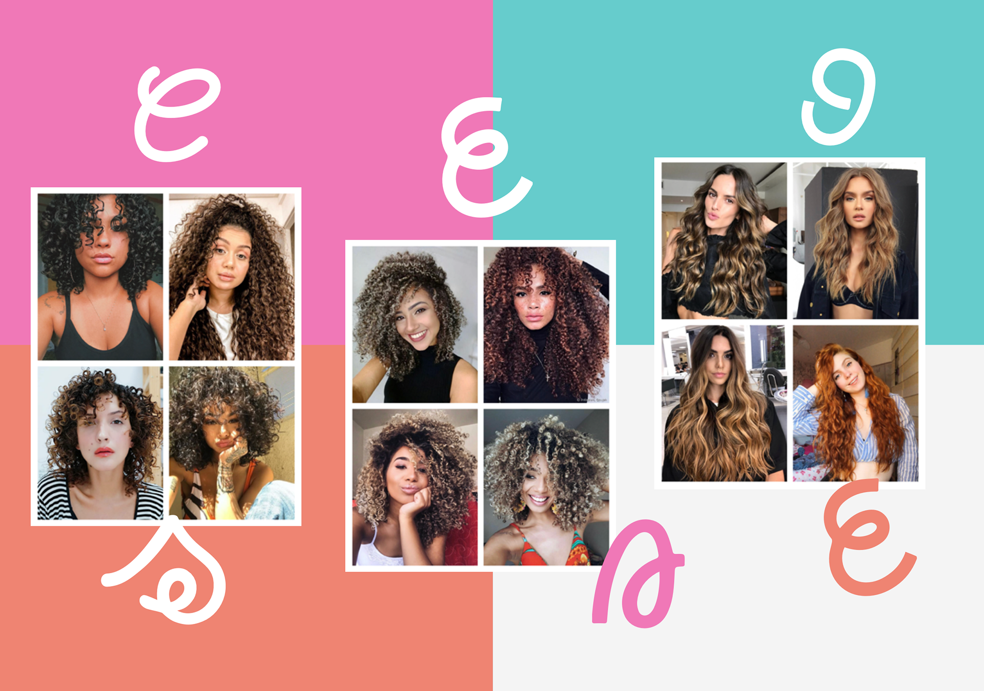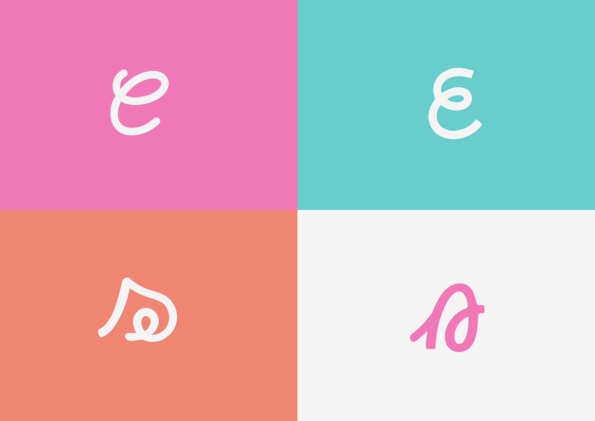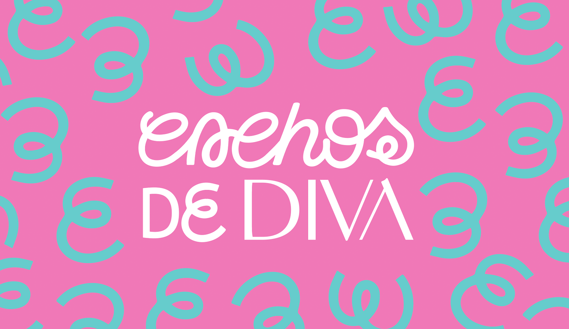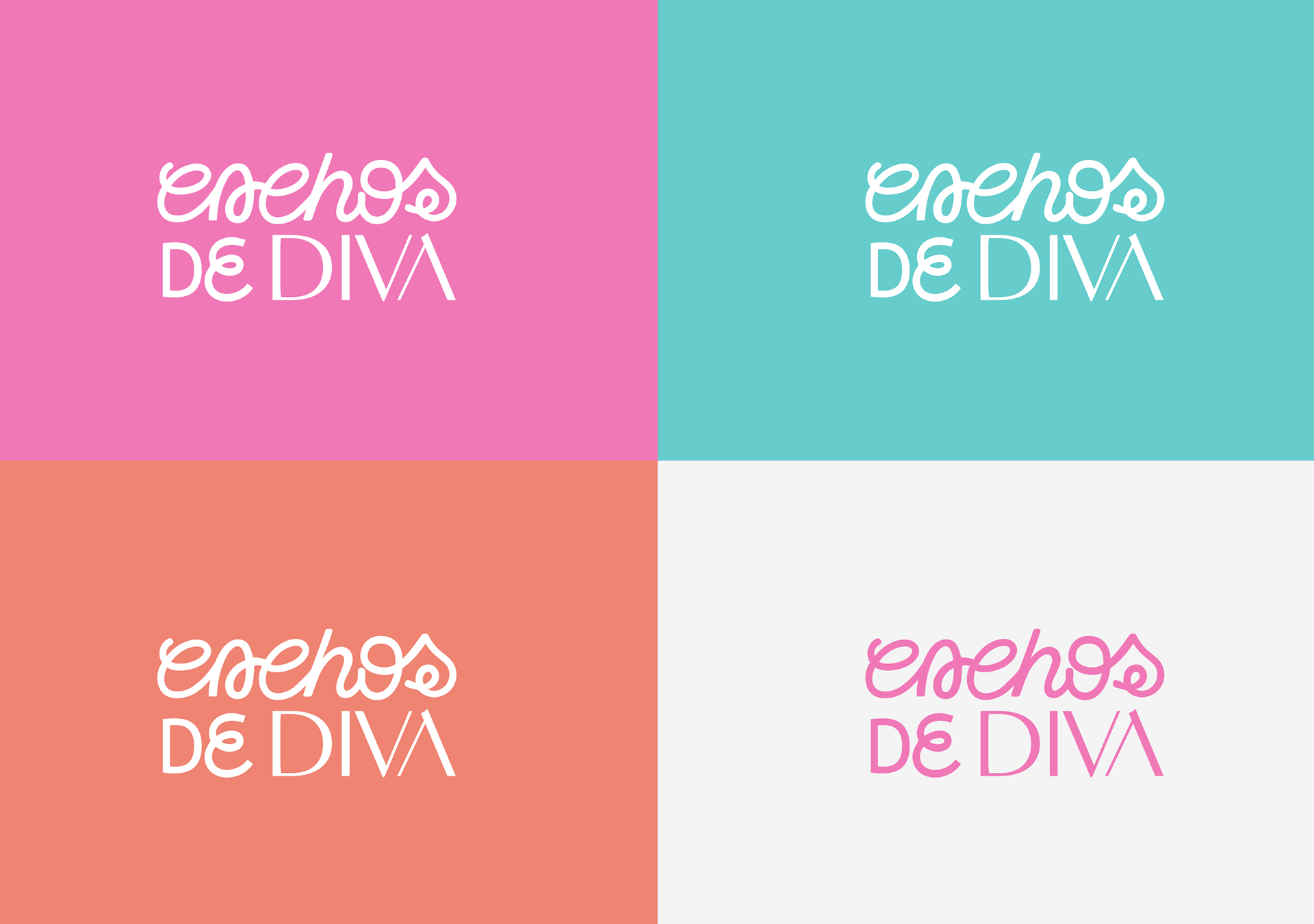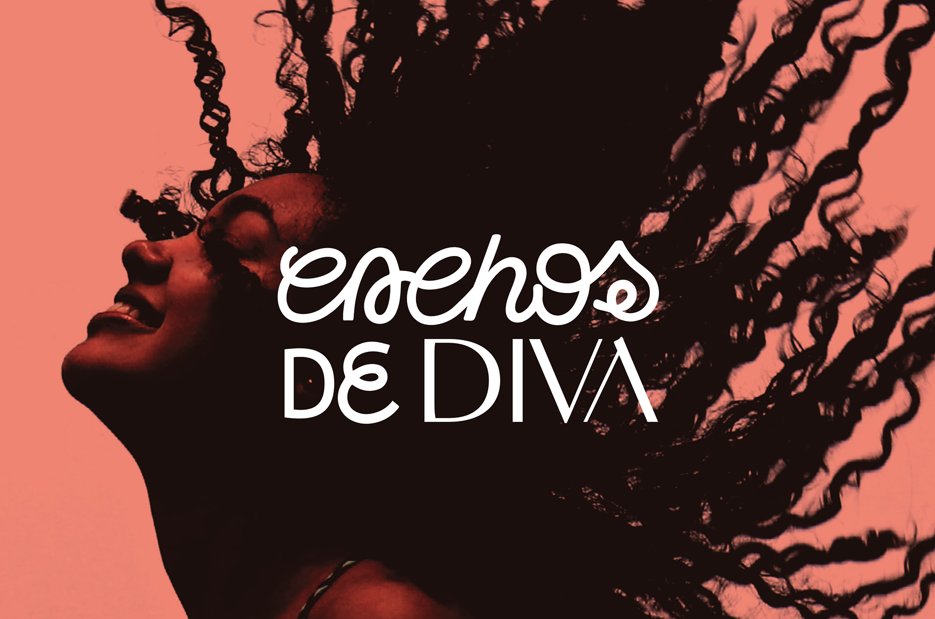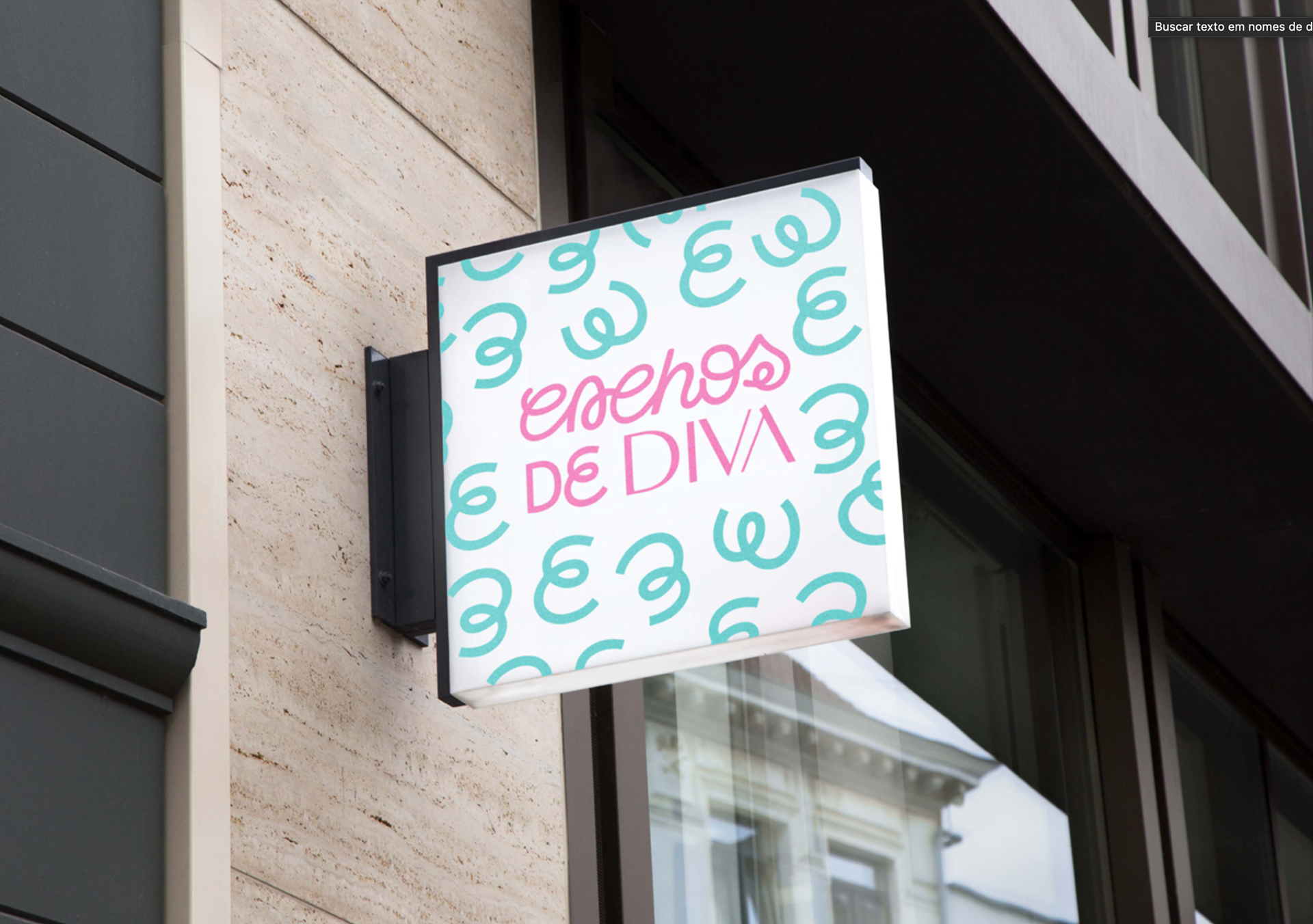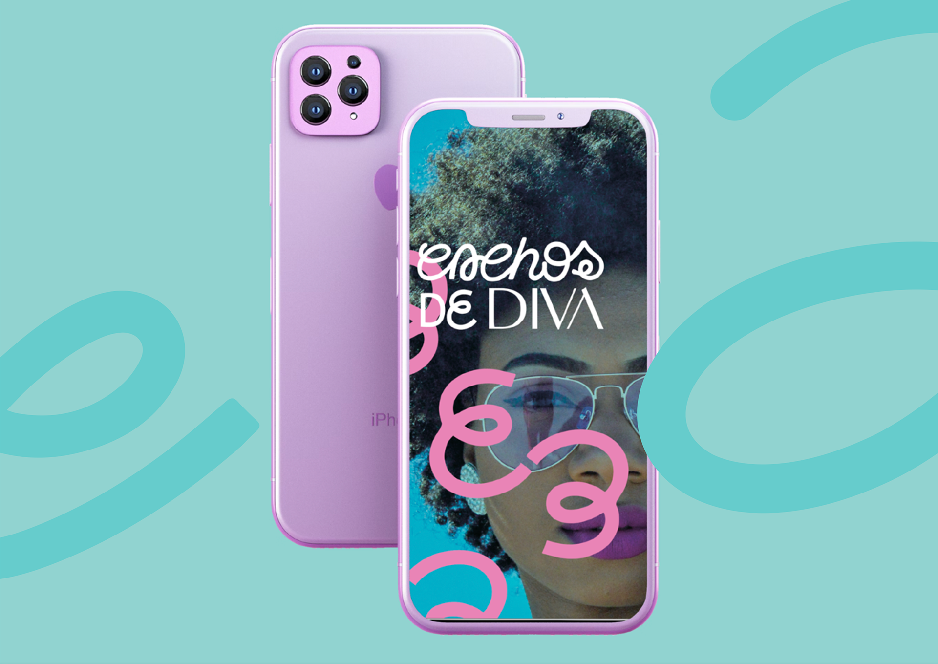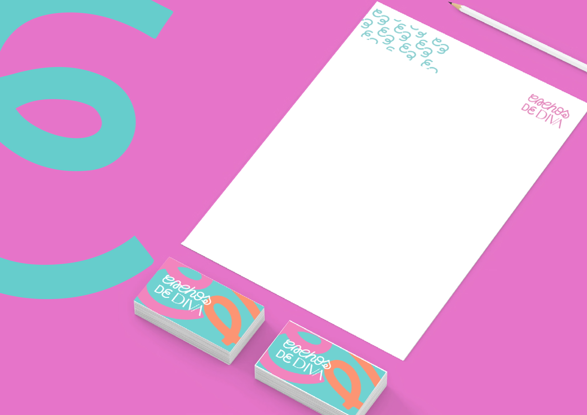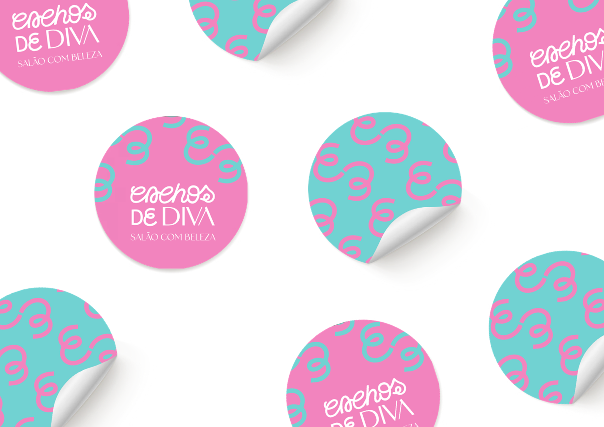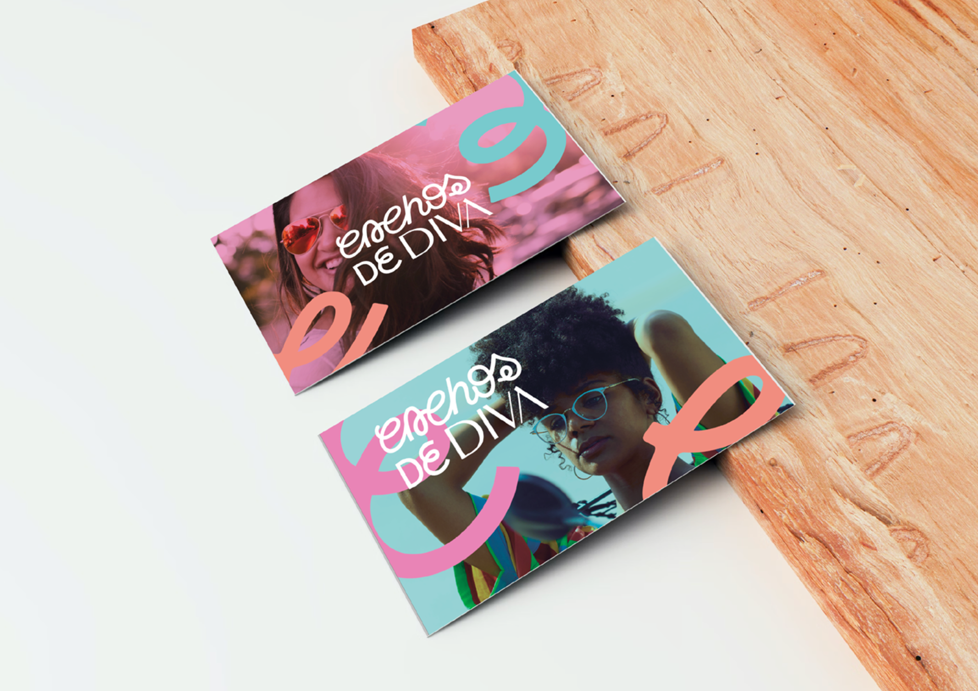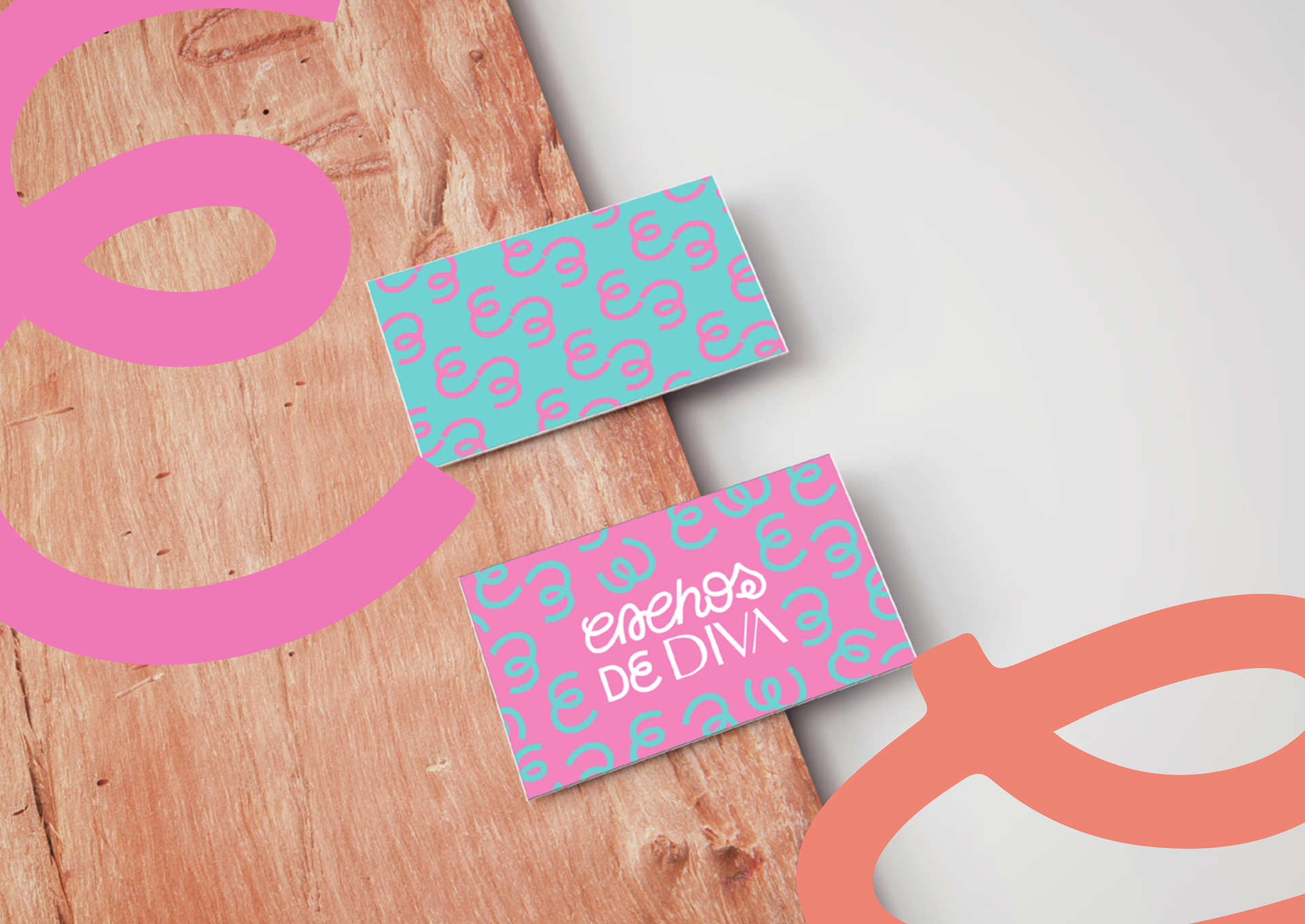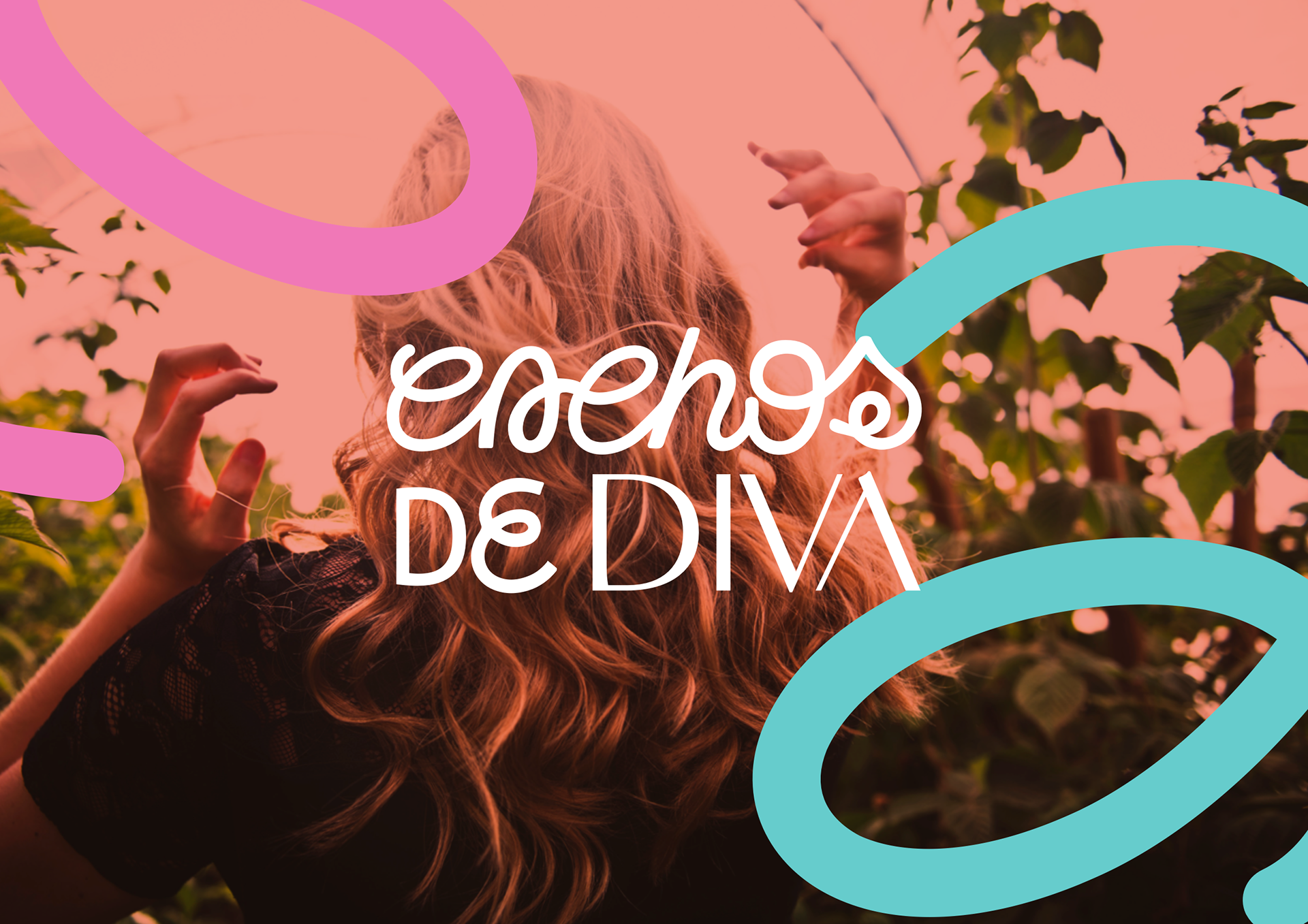
As letras da palavra "cachos" foram inspiradas nos cachos de cabelo que ficam no chão do salão, depois de um corte de cabelo. São vários tipos de cachos, e de letras, representando a diversidade de público que a marca possui, e a diversidade como valor que ela traz em sua estratégia de marca. Já a fonte da palavra "diva" agrega contraste e modernidade, com uma seriedade que associa a marca a excelência, característica fundamental de suas entregas.
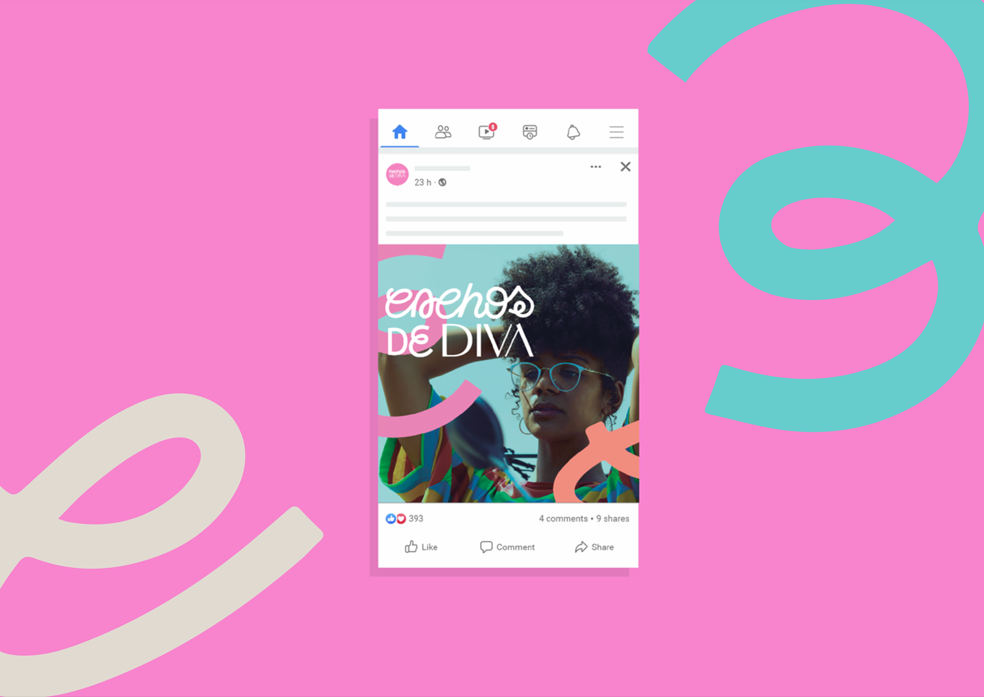
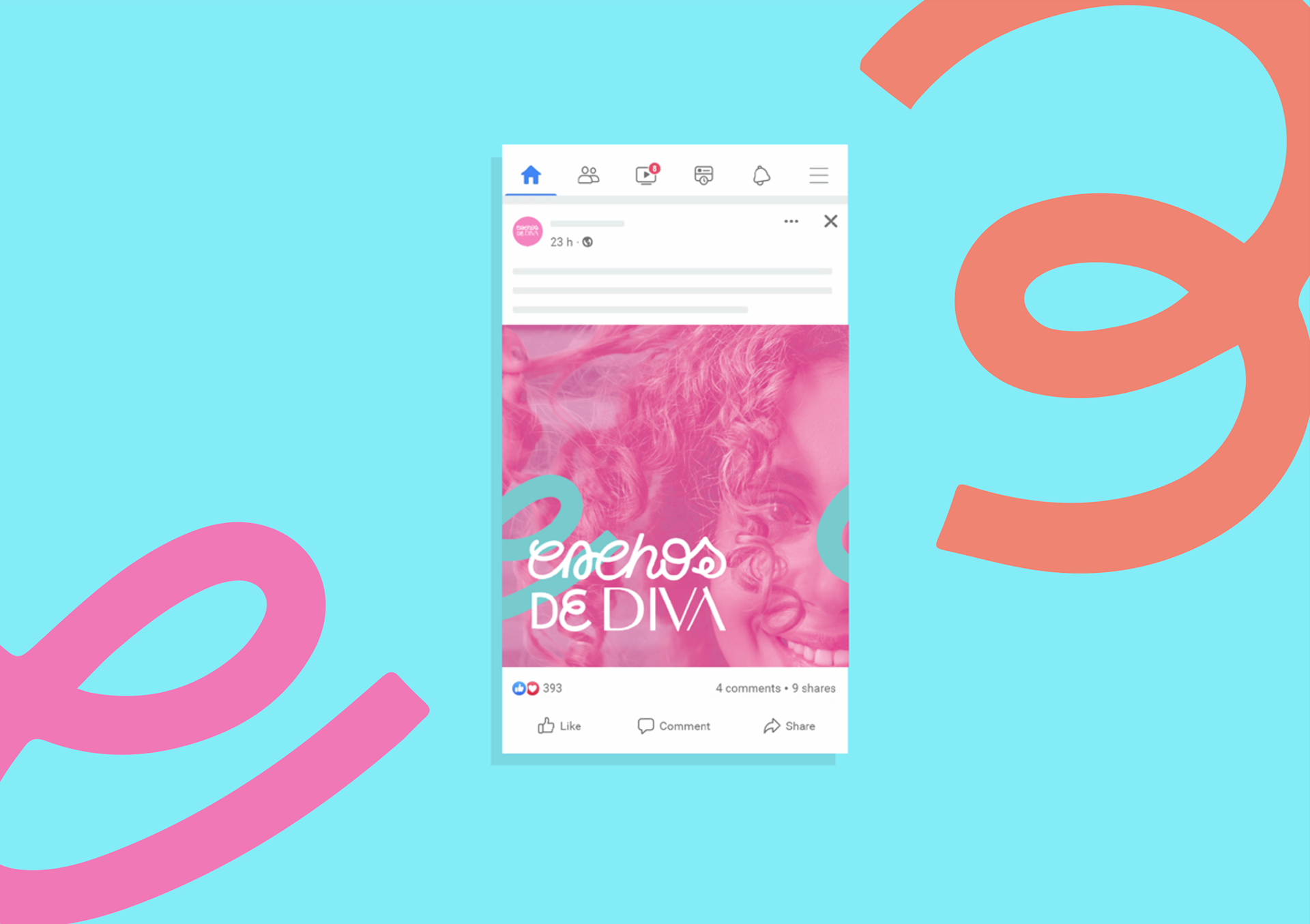
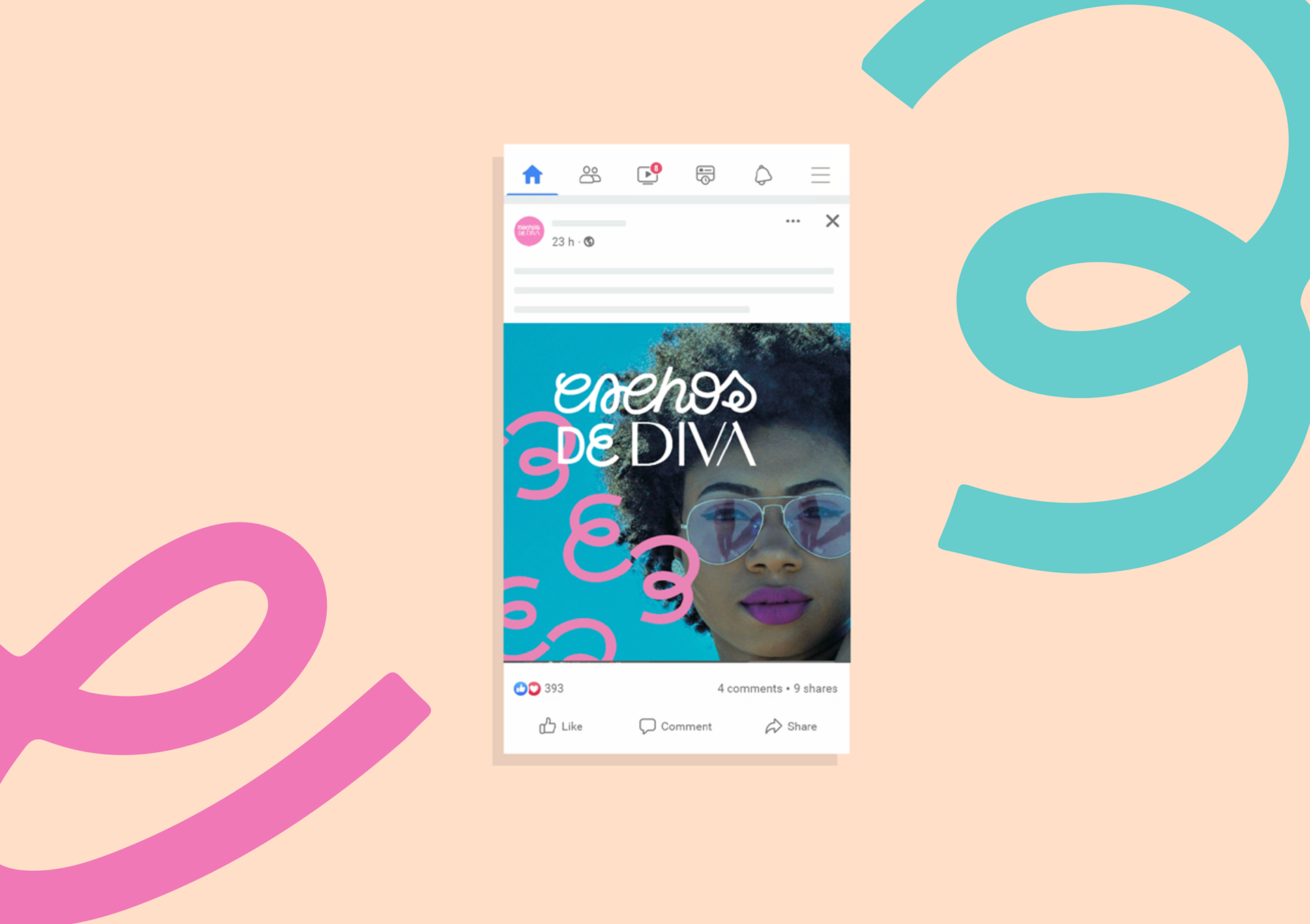
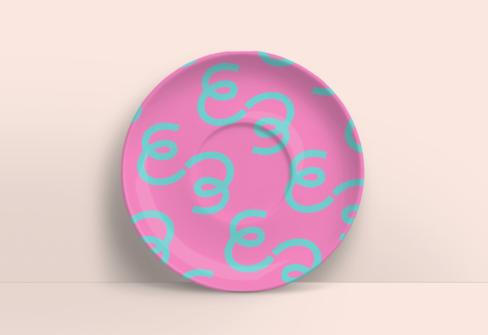
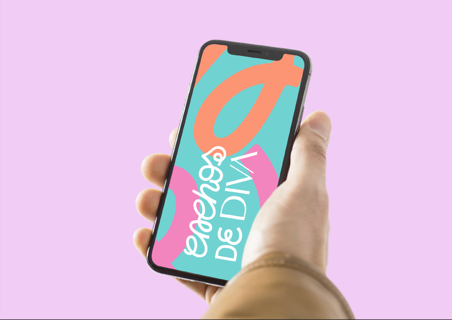
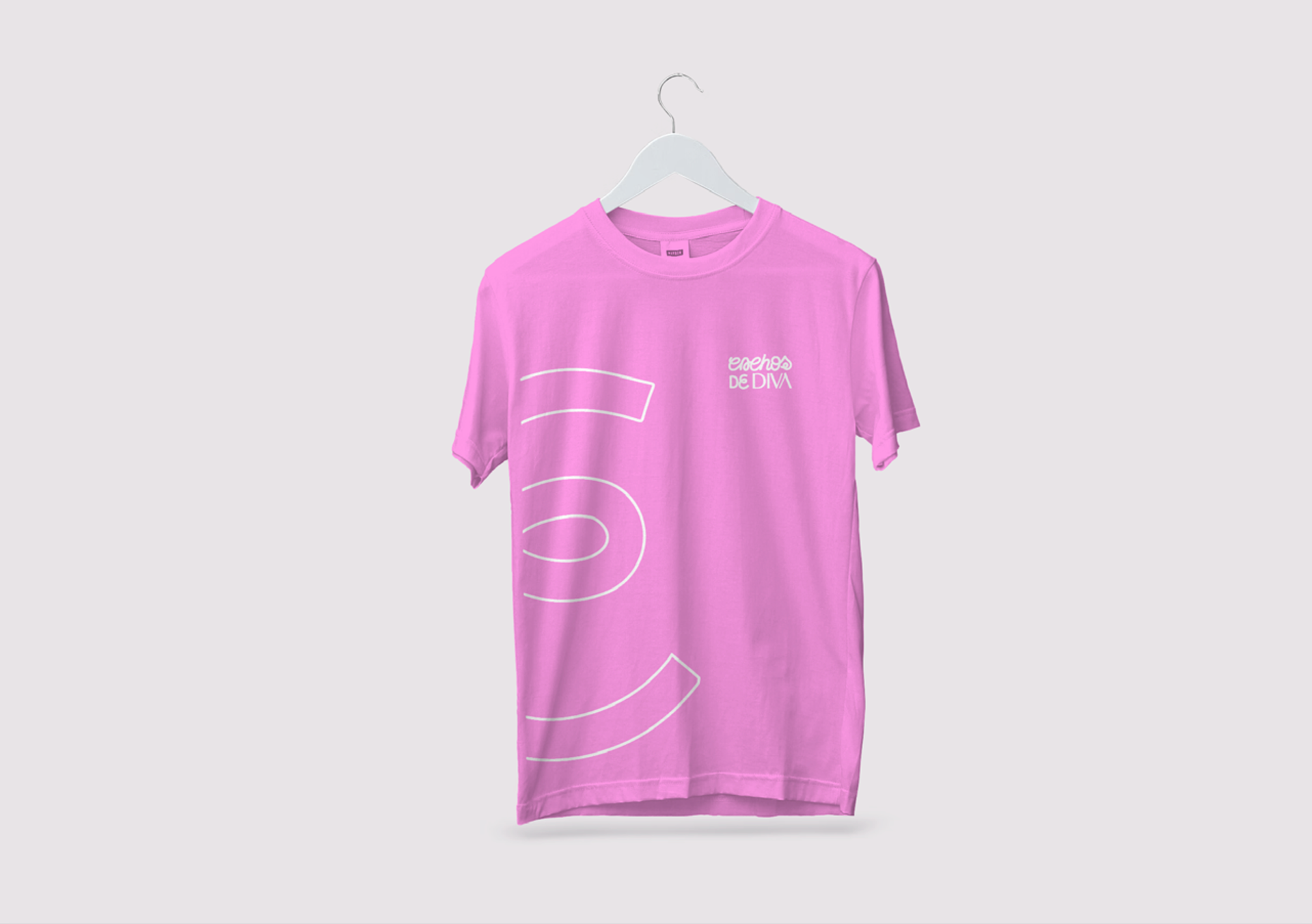
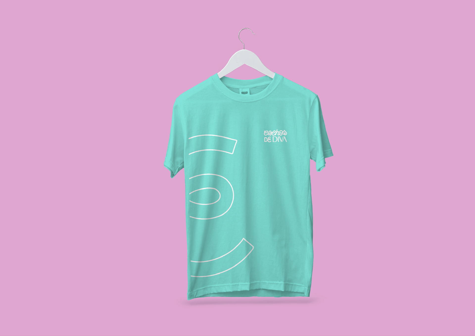
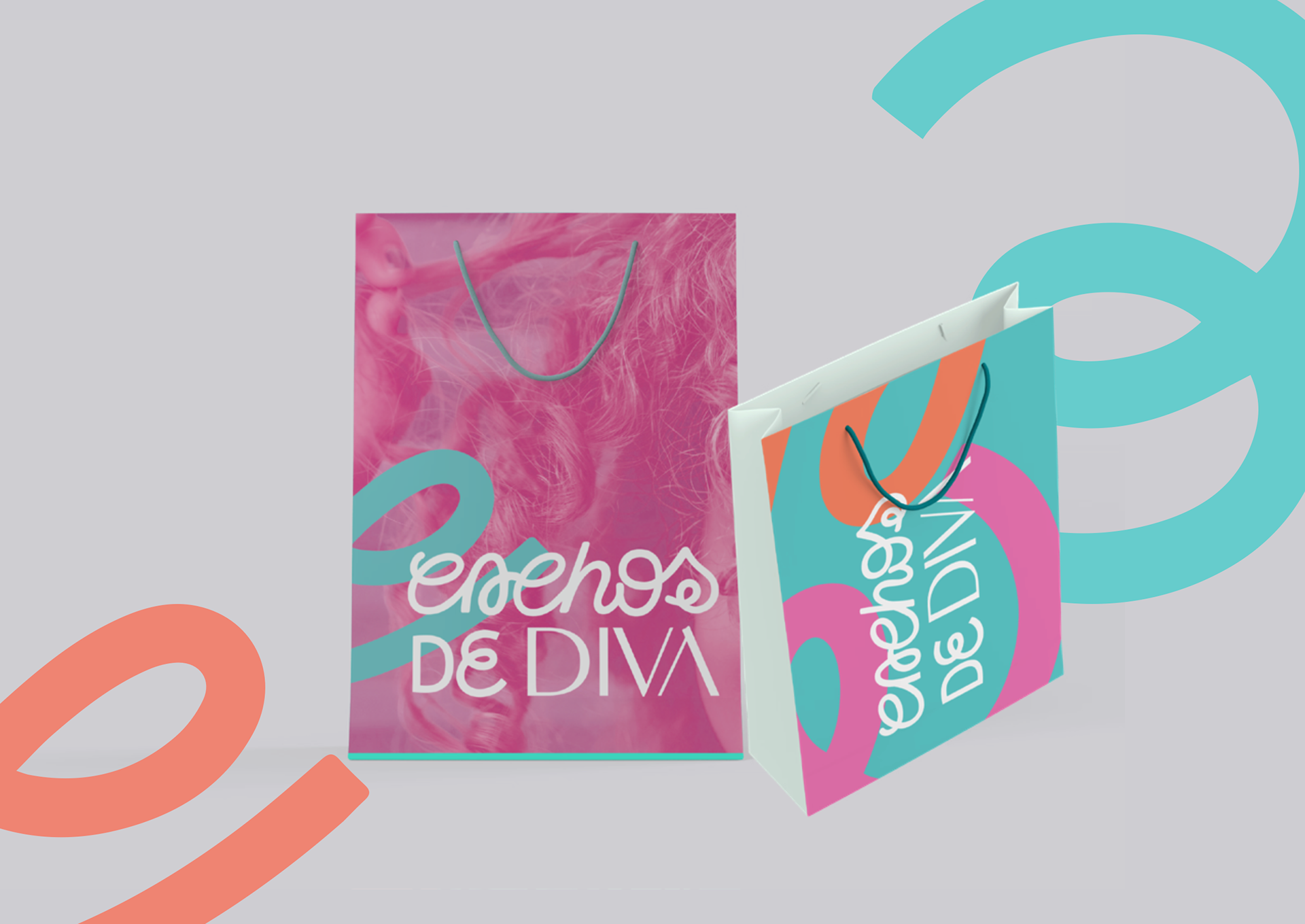
Suas cores trazem a jovialidade e a feminilidade que o briefing requisitava, além de serem as cores que a marca já utilizava e já eram associadas à ela (trata-se de um projeto de rebrand, envolvendo a criação de plataforma de marca e identidade visual completa, com nova logo, elementos de apoio e aplicações).
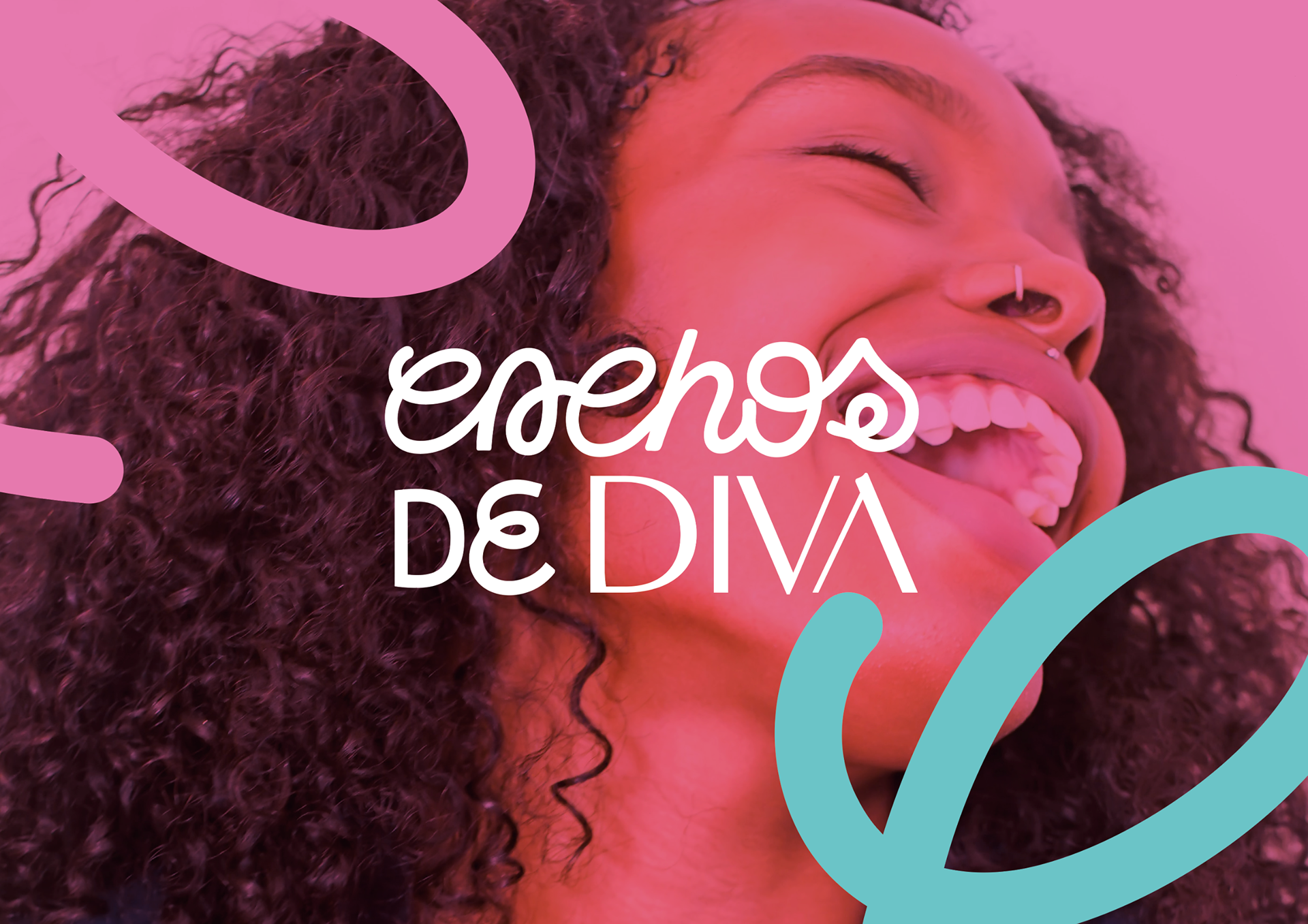
The letters in the word "cachos" (curls) were inspired by the curls of hair that remain on the salon floor after a haircut. There are various types of curls and letters, representing the diversity of the audience that the brand has, and diversity as a value that it brings to its brand strategy. The font of the word "diva" adds contrast and modernity, with a seriousness that associates the brand with excellence, a fundamental characteristic of its deliveries.
Its colors bring the youthfulness and femininity that the brief requested, in addition to being the colors that the brand already used and were already associated with it (this is a rebrand project, involving the creation of a brand platform and complete visual identity, with a new logo, supporting elements and applications).