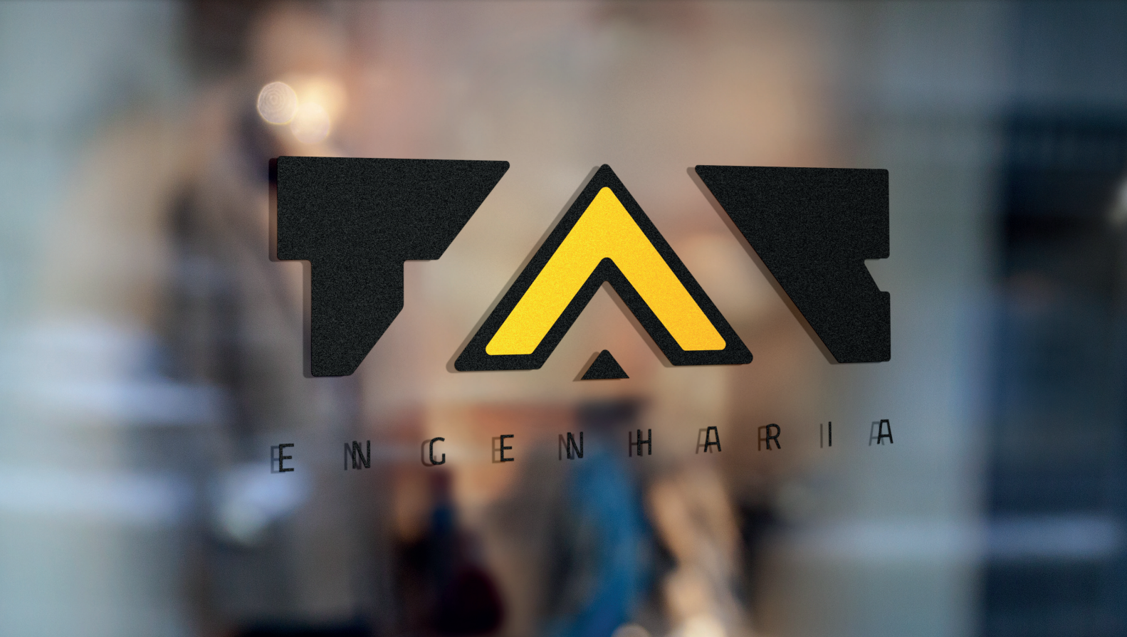
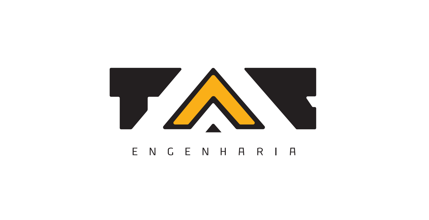
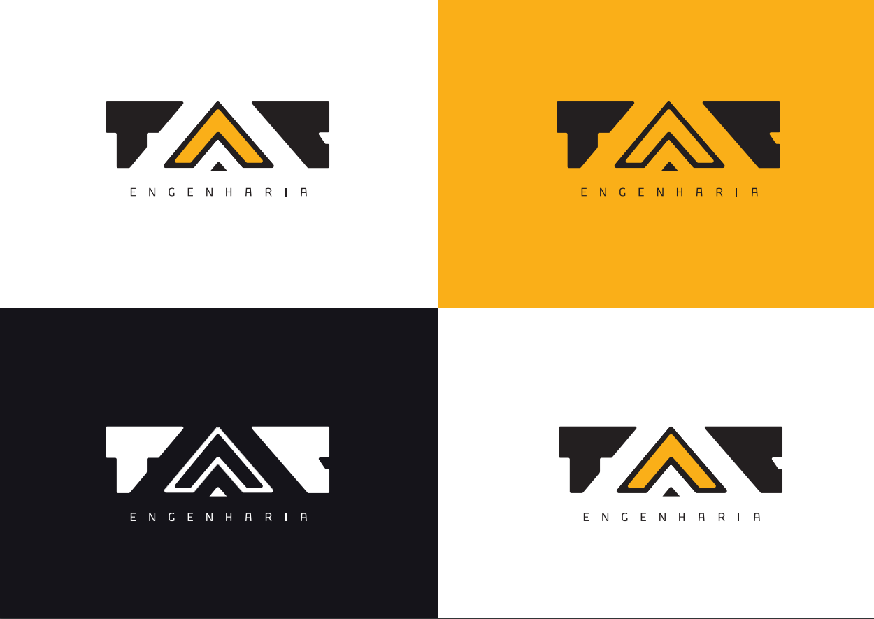
A TAC Engenharia buscava reposicionar-se no mercado como uma das referências em seu setor (obras de infraestrutura, com foco em rodovias, estradas) continuando sua história de valor e de bons relacionamentos, passando a ser, também, referenciada entre as construtoras mais modernas, seguras e organizadas do setor.
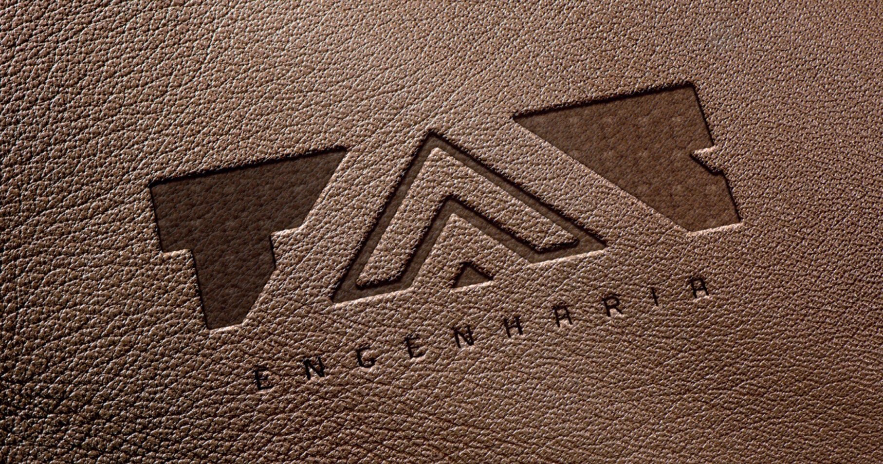
Projeto: criação de estratégia de marca (plataforma com atributos, personalidade, posicionamento, etc) e identidade visual (criação de logo, elementos visuais e aplicações) para empresa de engenharia, representando força, responsabilidade, segurança, tecnologia, obras e estradas.
TAC Engenharia sought to reposition itself in the market as one of the references in its sector (infrastructure works, with a focus on highways, roads) continuing its history of value and good relationships, also becoming a reference among the most modern, safe and organized construction companies in the sector. / Project: creation of a brand strategy (platform with attributes, personality, positioning, etc.) and visual identity (creation of a logo, visual elements and applications) for an engineering company, representing strength, responsibility, safety, technology, engeneering and roads.

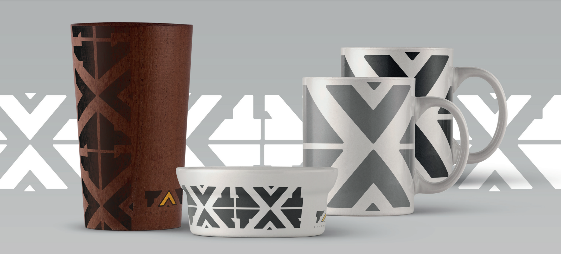
Aproveitamos a figura da insígnia militar, através do uso de suas características estruturais e formas, para trazer valores associados a esse universo, como: tradição, segurança, responsabilidade e organização/ infraestrutura, no intuito de serem vinculados ao conjunto visual da marca.
We used of the figure of the military insignia, through its structural characteristics and shapes, to bring values associated with this universe, such as: tradition, security, responsibility and organization/infrastructure, with the aim of being linked to the visual set of the brand.


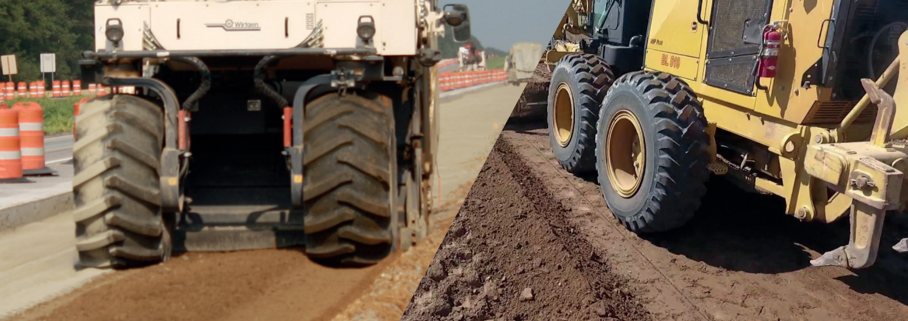
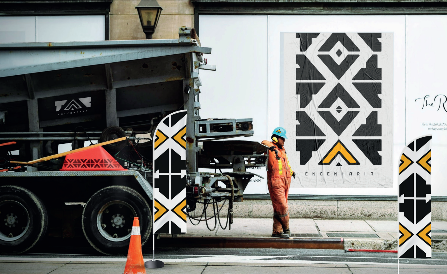
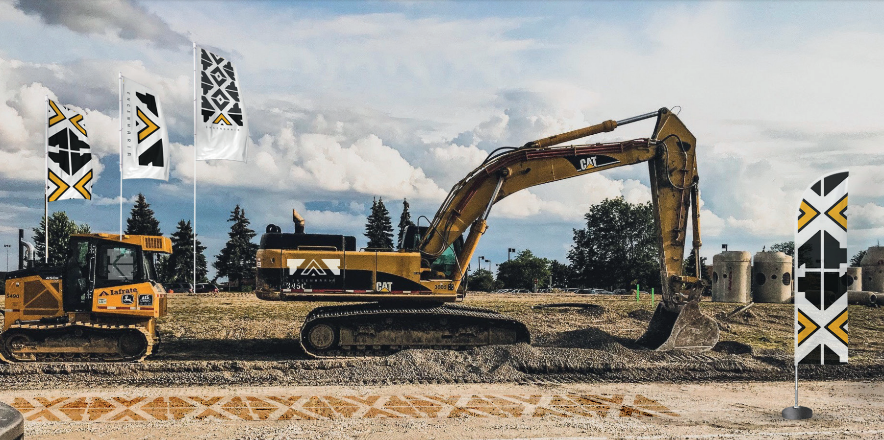
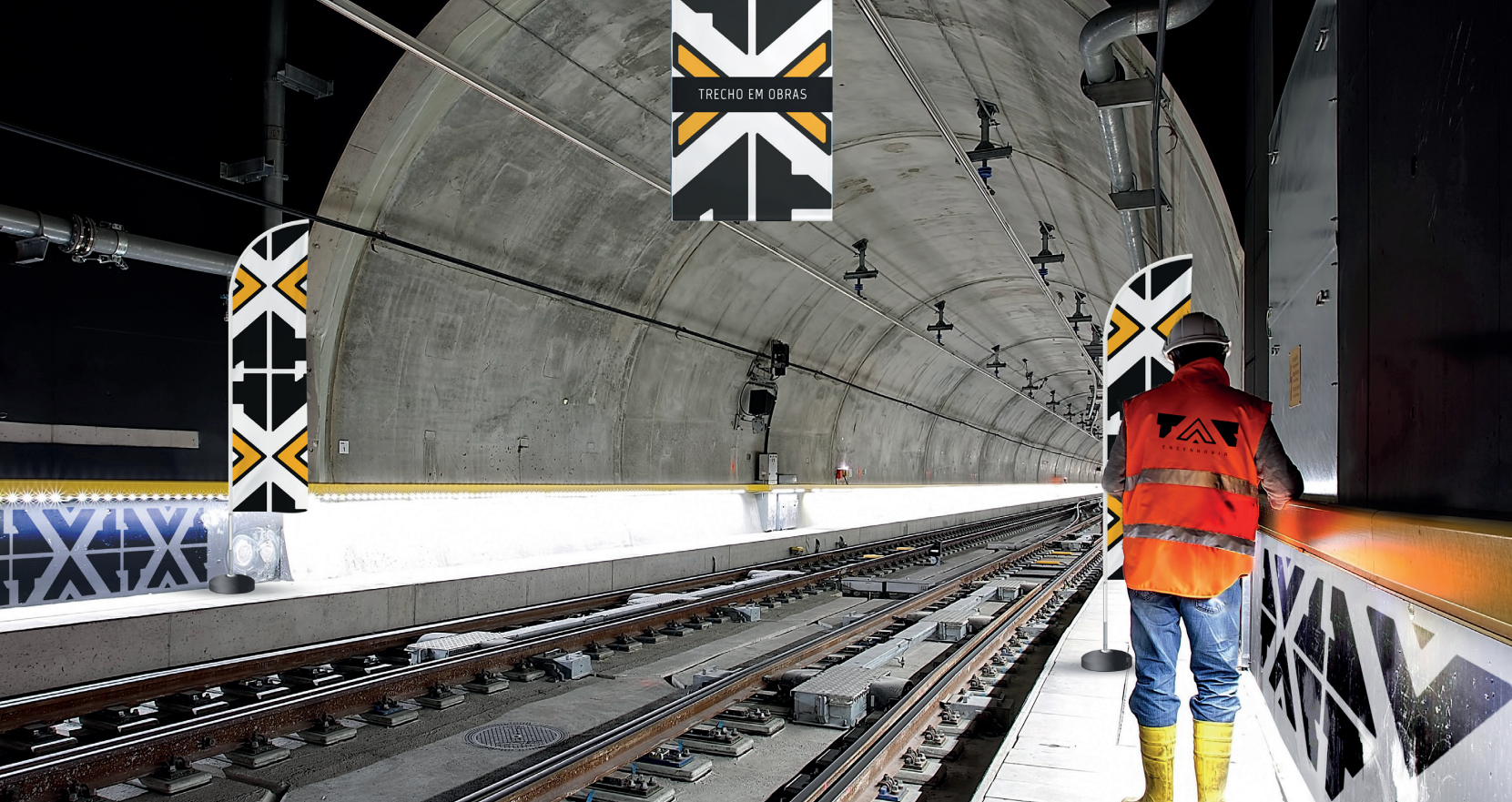
O uso frequente de tratores e máquinas pesadas deixam marcas no solo por onde passam, e são formas onipresentes em canteiros de obras. Isso representa a força da TAC, e o uso dessas formas é explorado através da repetição da logo, criando um padrão que se assemelha às marcas de pneus, e traz modernidade à marca.
The frequent use of tractors and heavy machinery leave marks on the ground wherever they go, and these are ubiquitous forms on construction sites. This represents the strength of TAC, and the use of these shapes is explored through the repetition of the logo, creating a pattern that resembles tire tracks, and brings modernity to the brand.

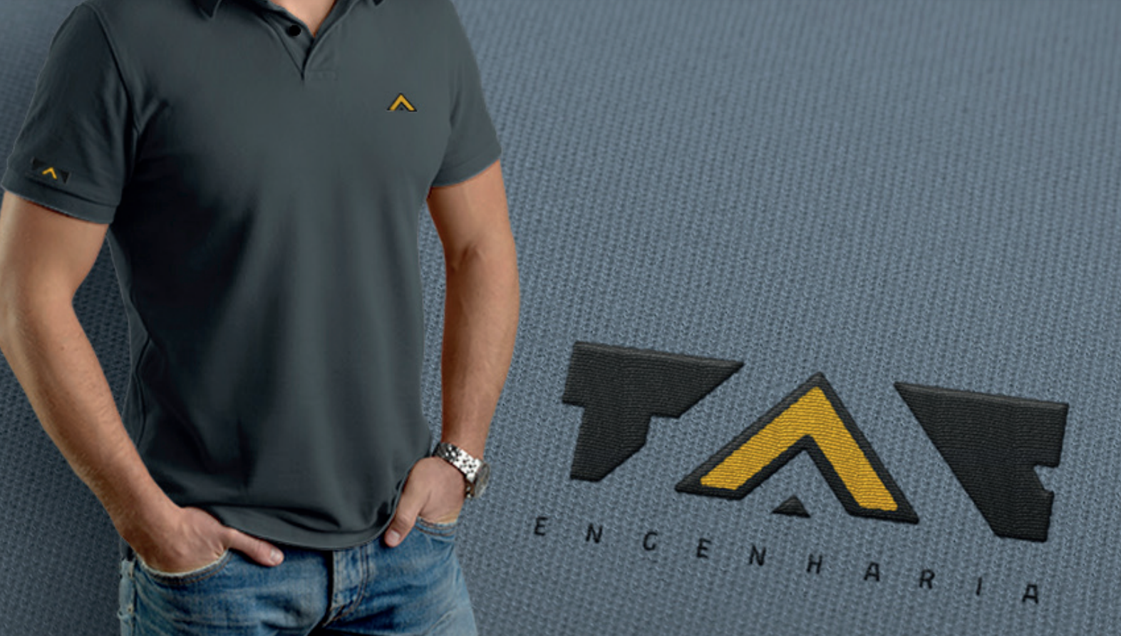
Aplicações em obras: maquinário, bandeiras, windbanners, placas, uniformes, paredes.