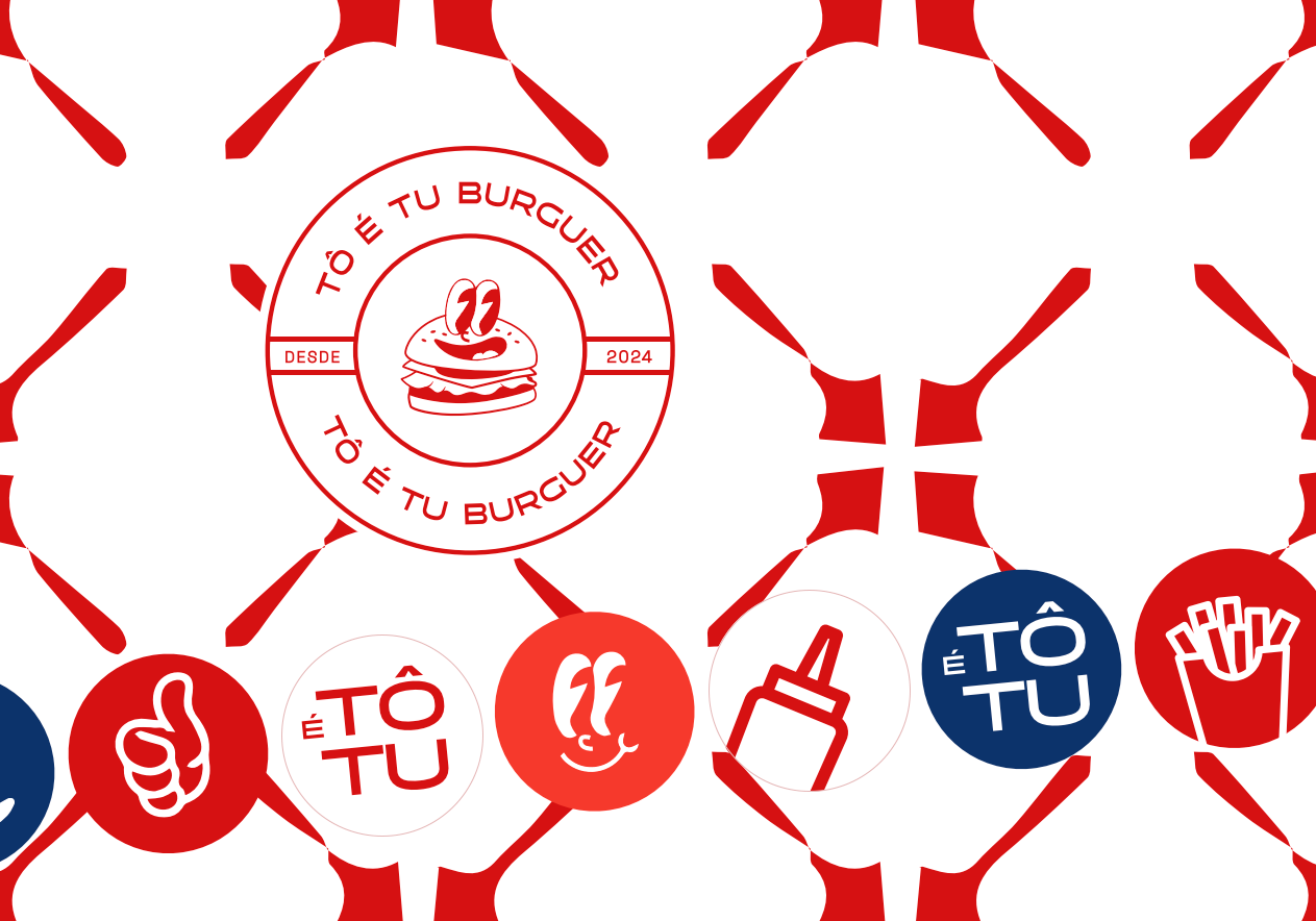
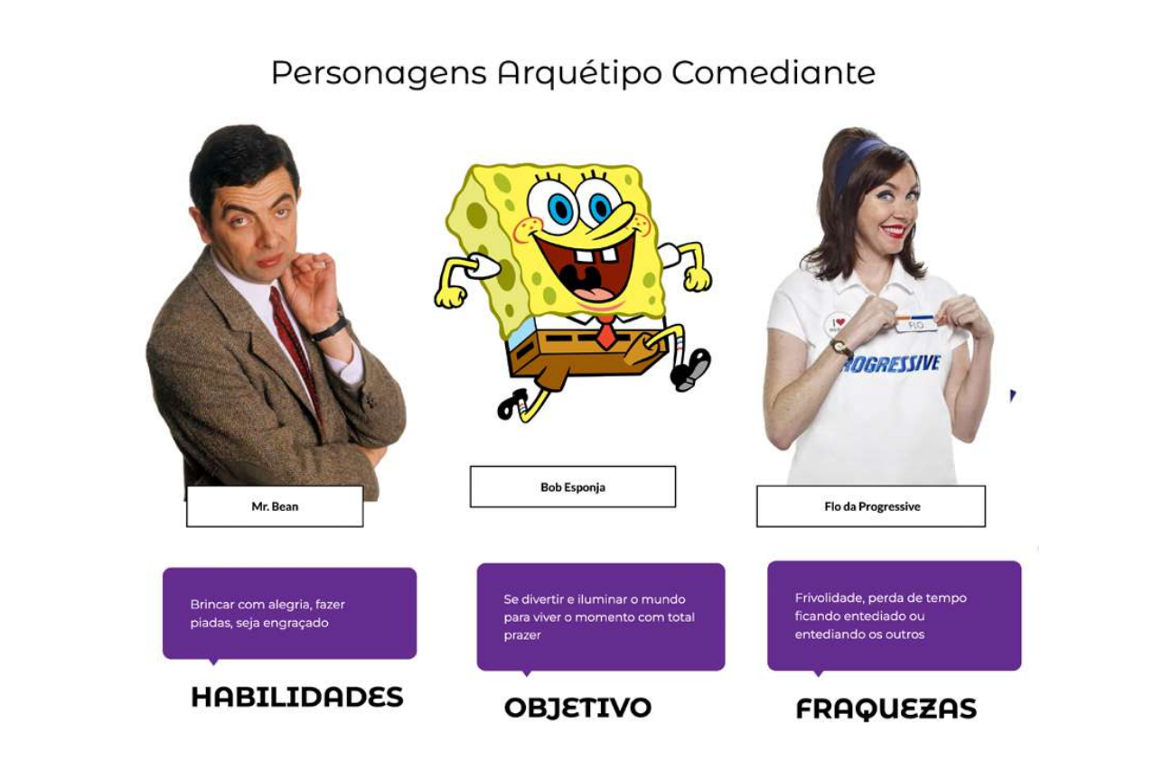
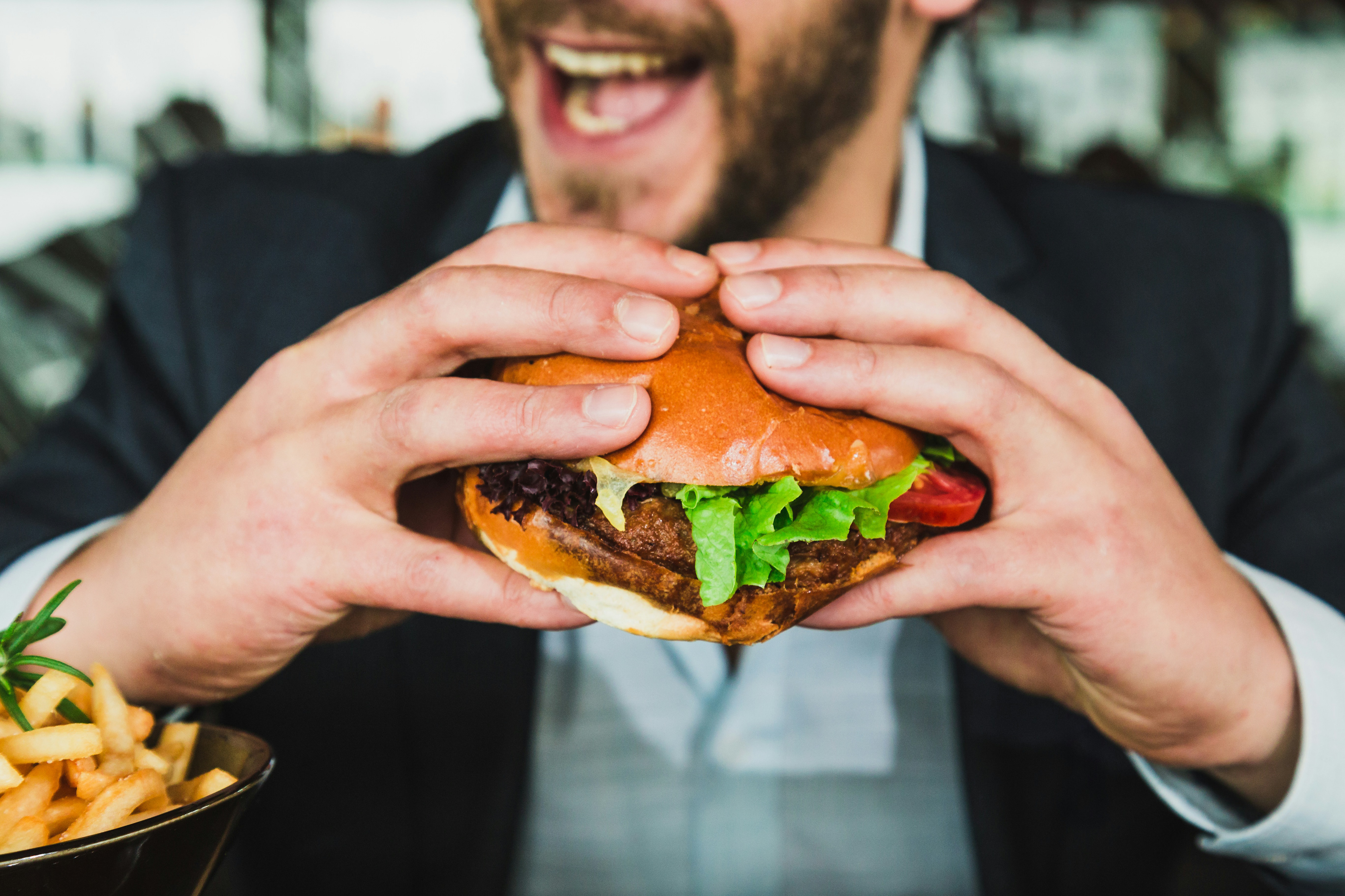
A hamburgueria TÔ É TU BURGUER procurava uma identidade visual que fosse leve e divertida, com aspectos regionais de São Luís e do Maranhão. Com as ótimas referências do cliente, pude trabalhar o arquétipo do bobo da corte (comediante) junto com elementos visuais do centro histórico e as cores do maranhão na criação de uma marca com a qual todo maranhense pode se identificar.
The burger restaurant TÔ É TU BURGUER was looking for a visual identity that was light and fun, with regional aspects of São Luís and Maranhão. With the client's great references, I was able to work on the archetype of the jester (comedian) together with visual elements of the historic center and the colors of Maranhão in creating a brand with which every Maranhão resident can identify.

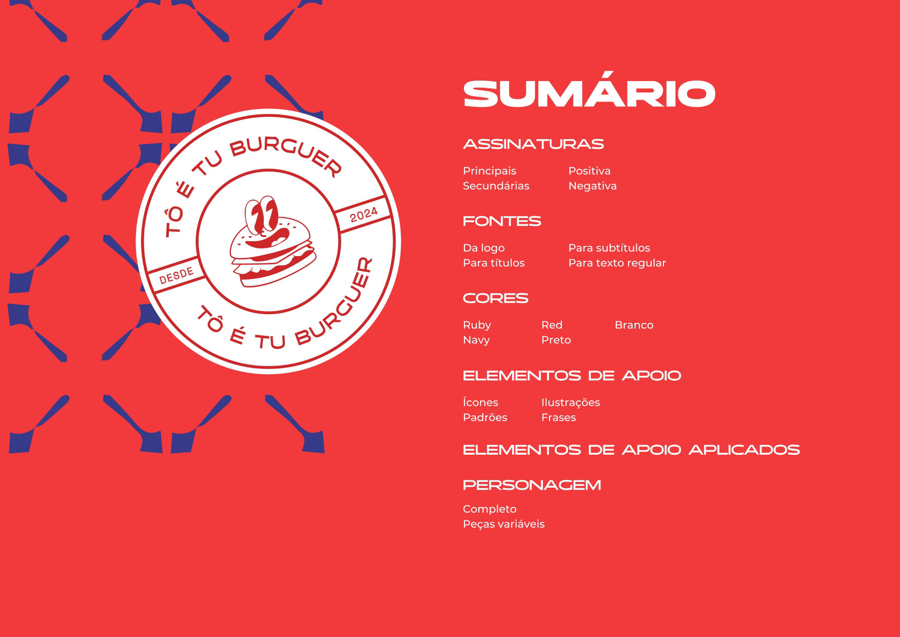
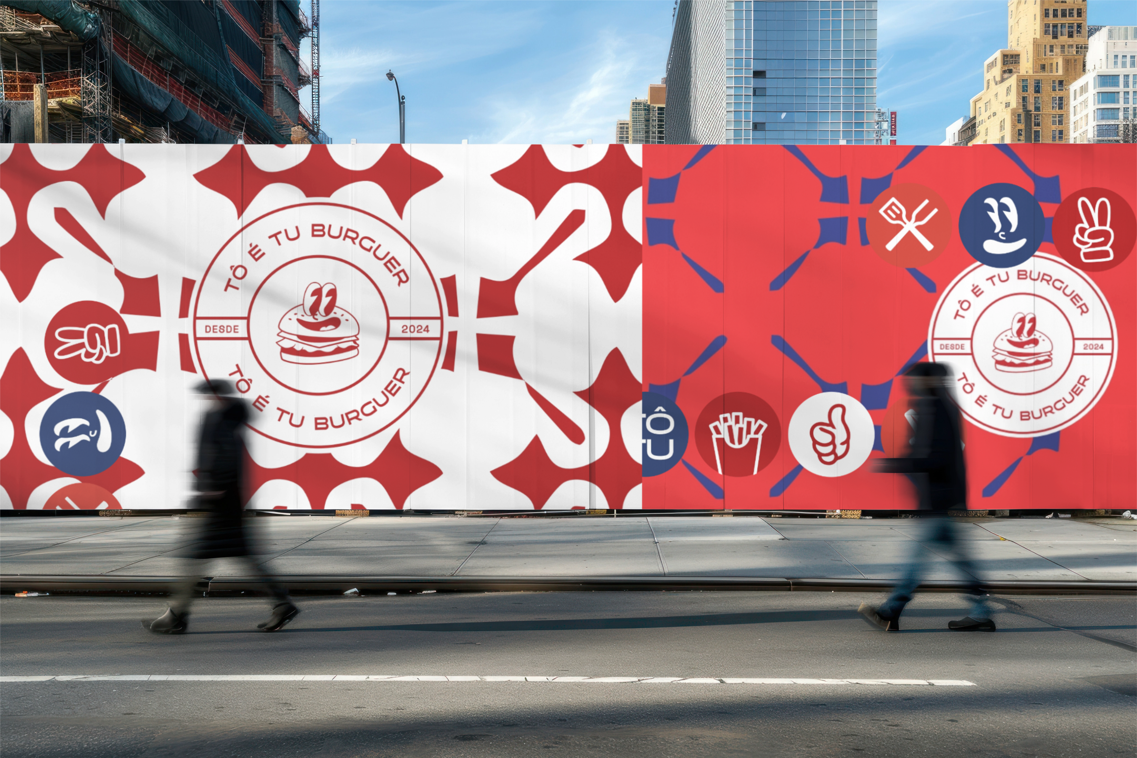
CONCEITO VISUAL
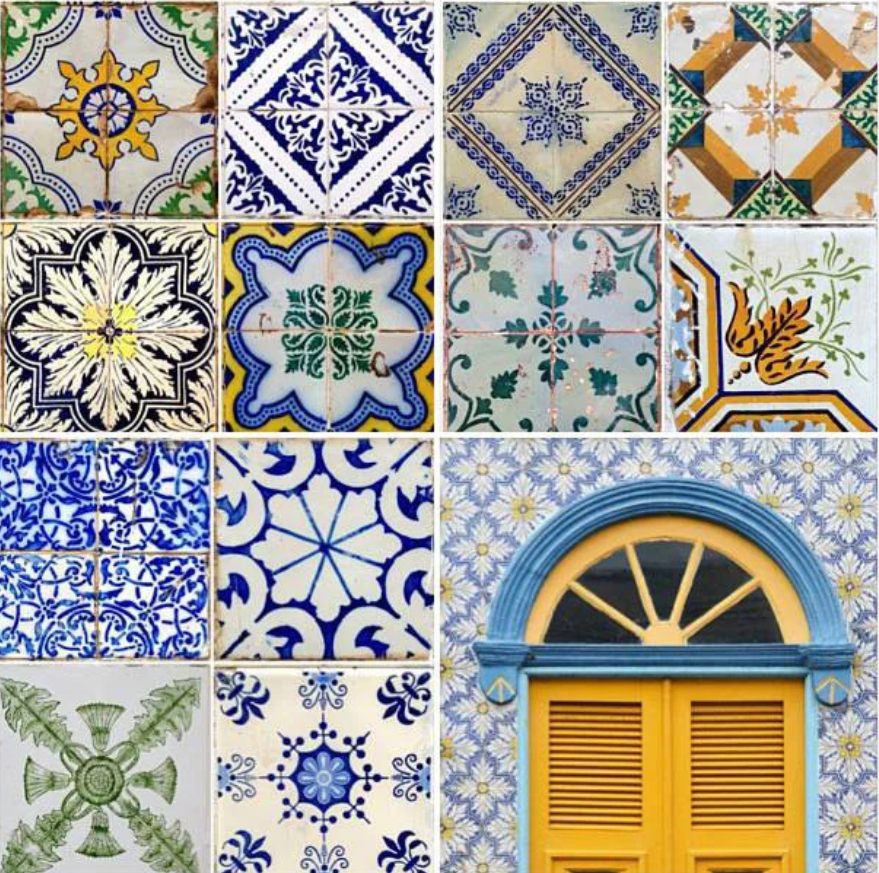
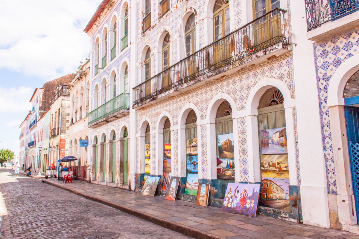
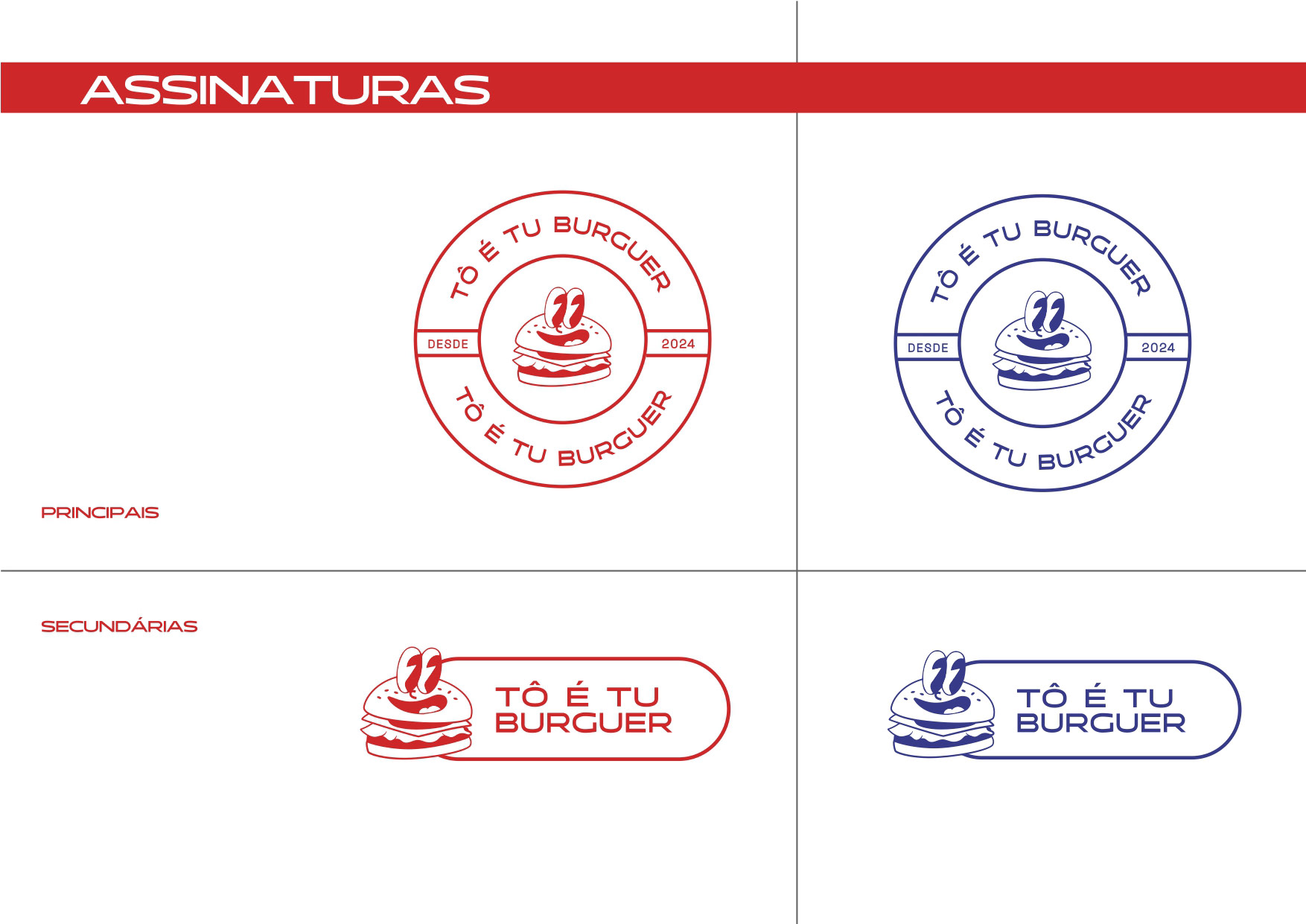
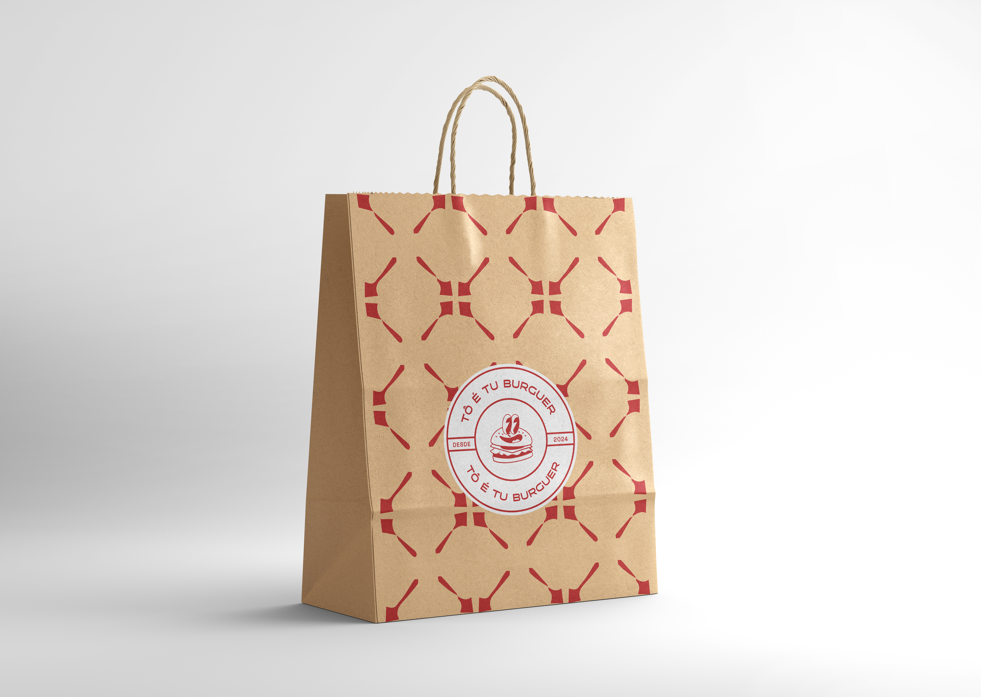
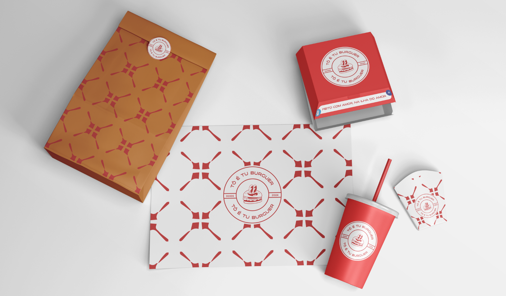
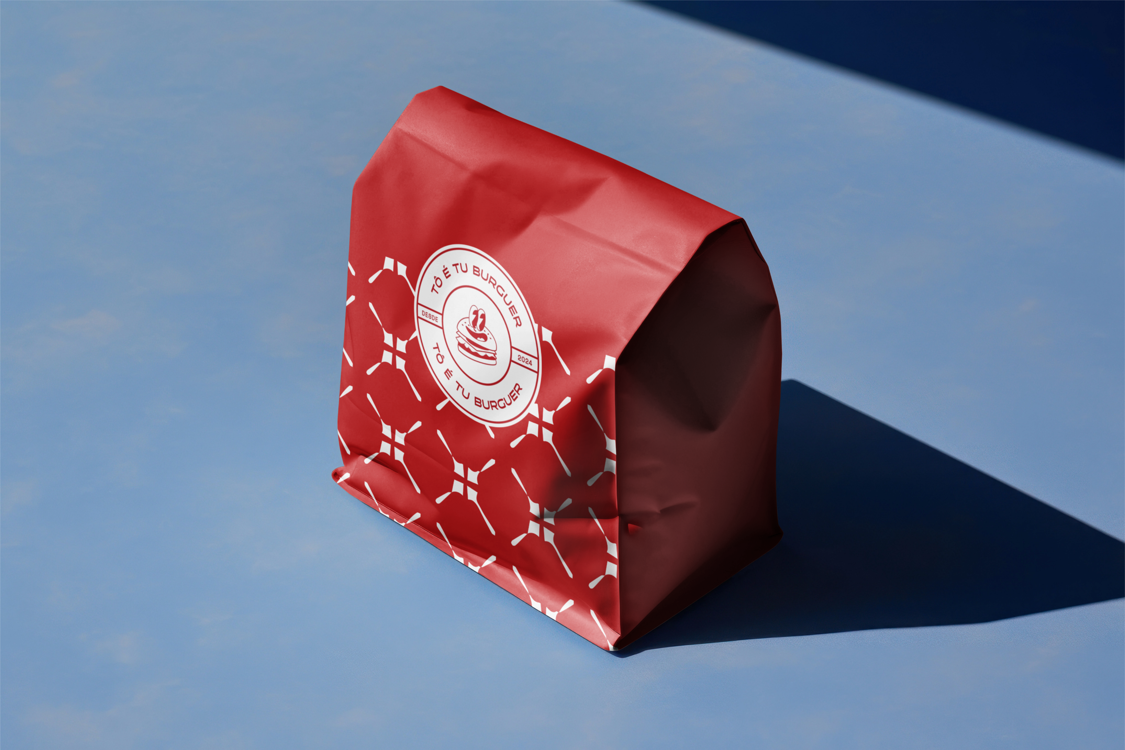
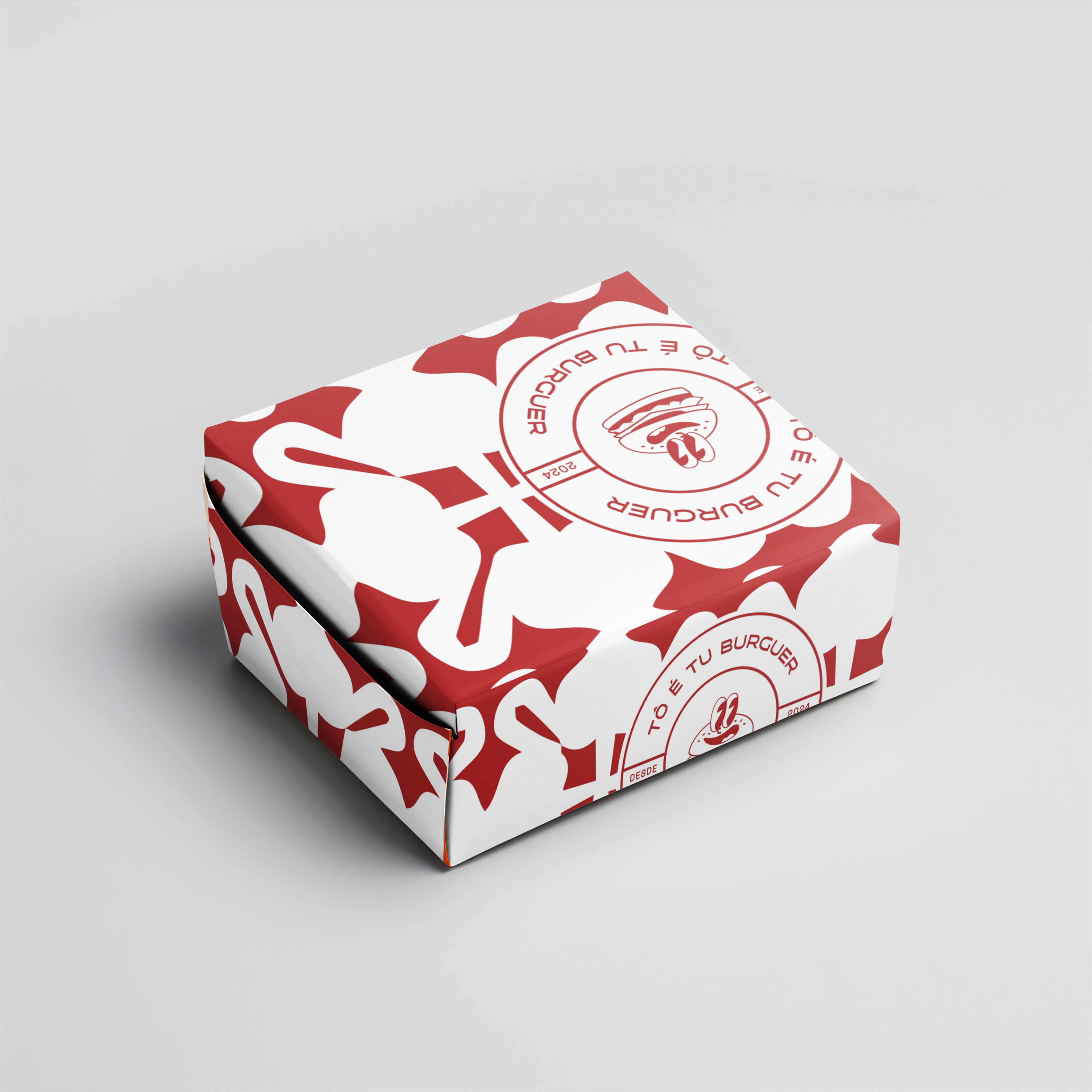
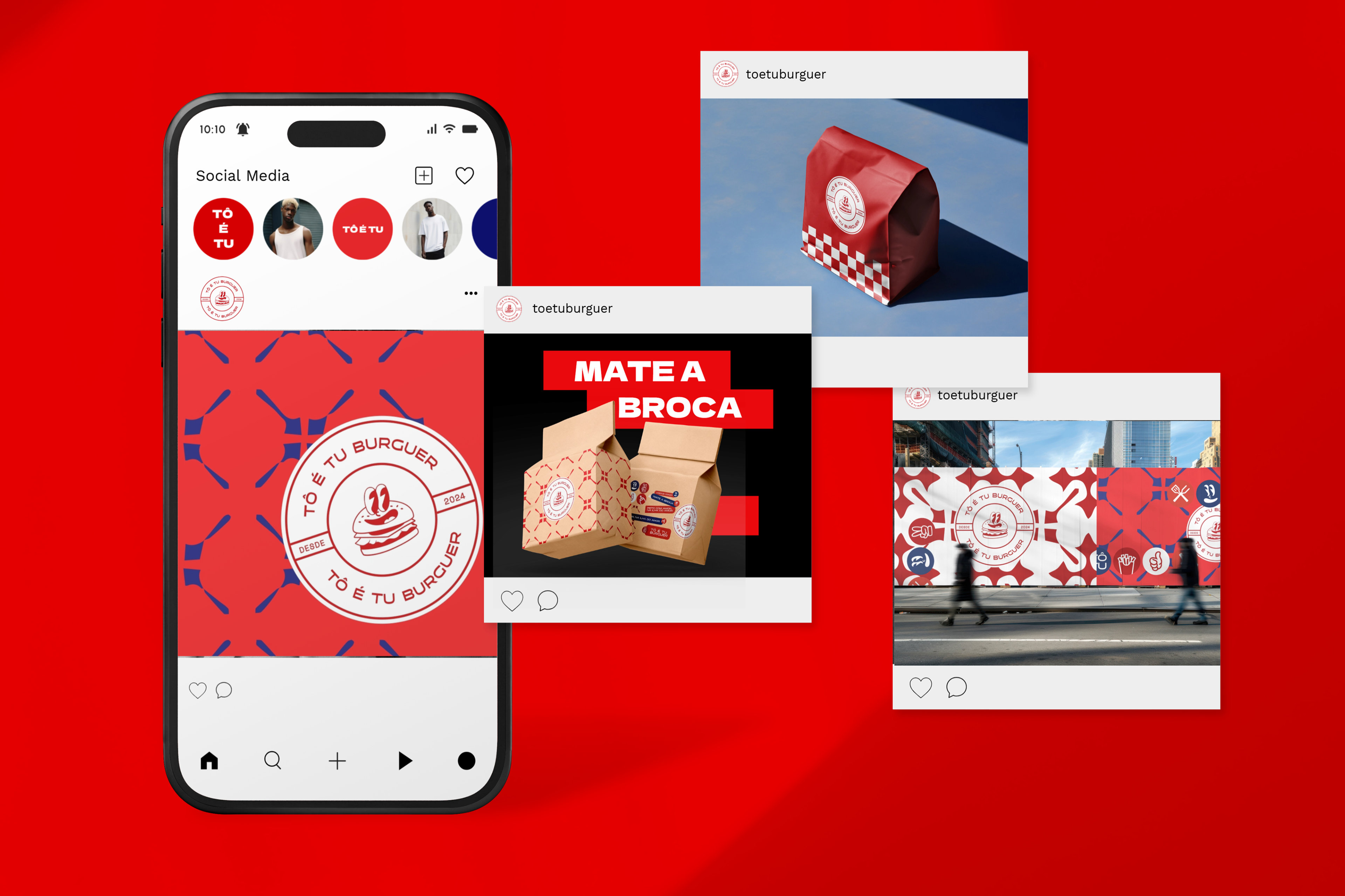
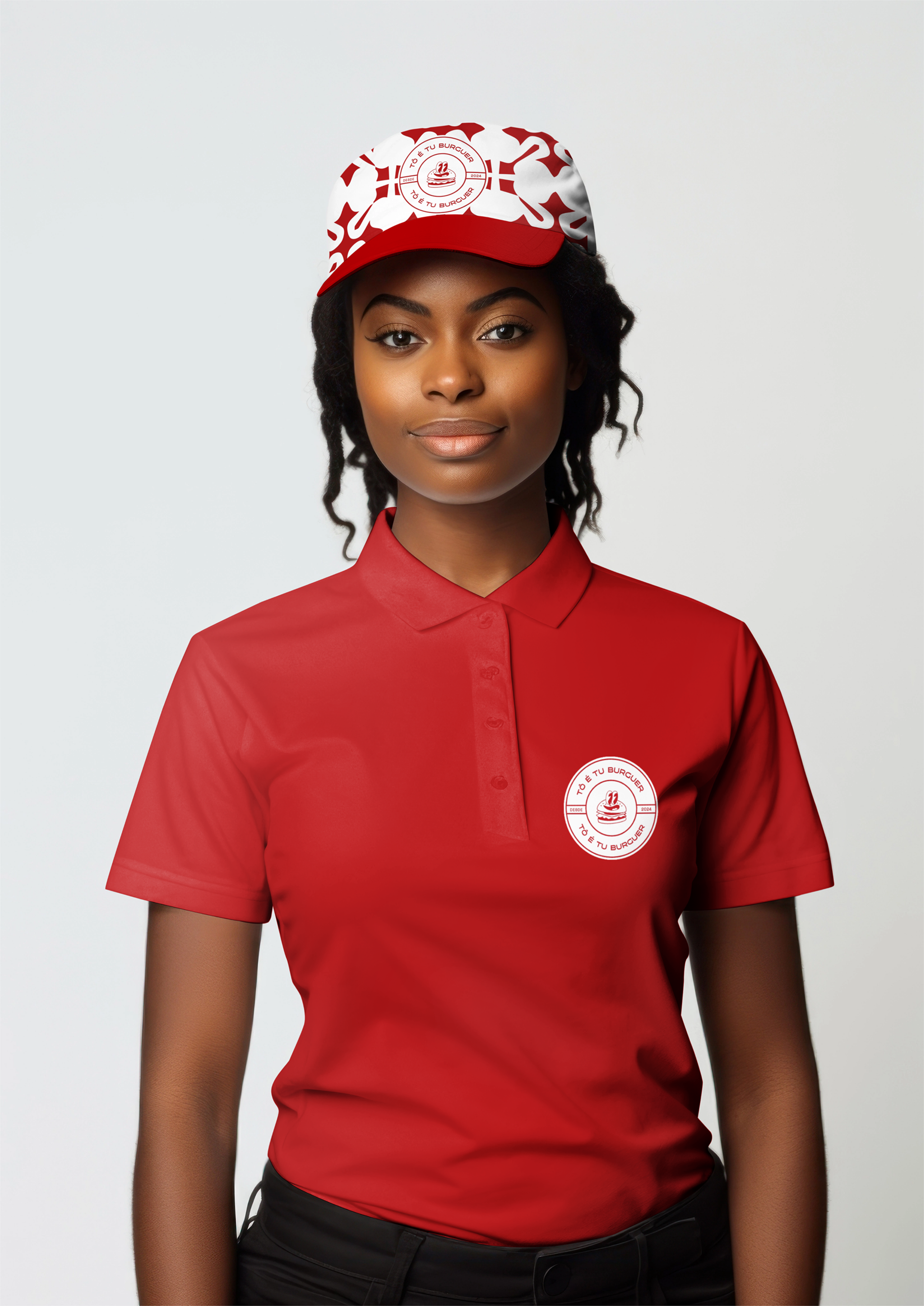
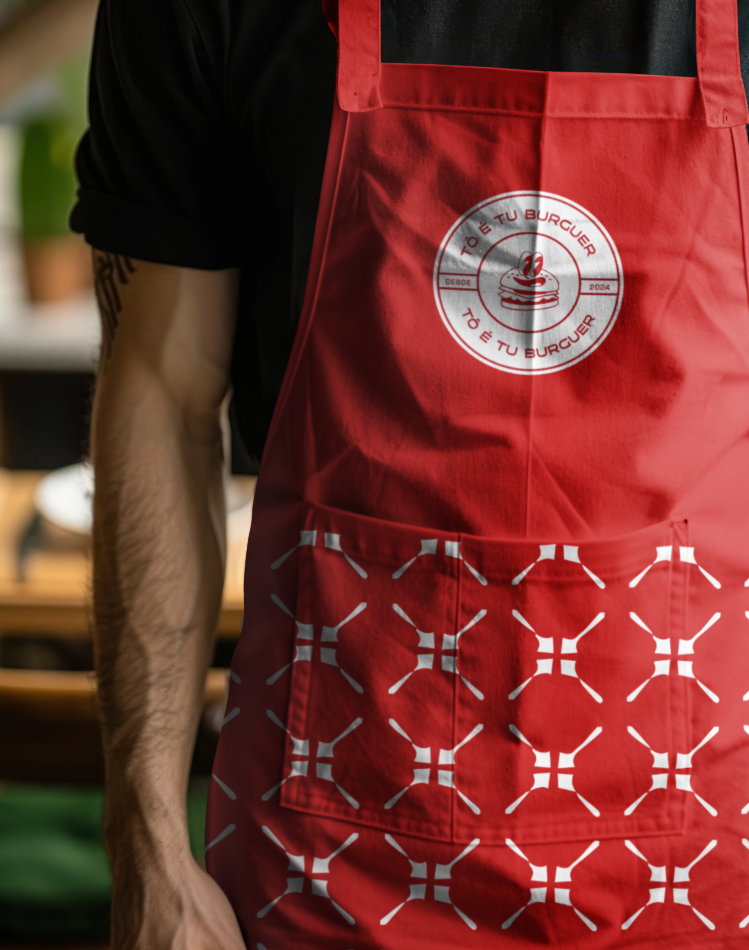
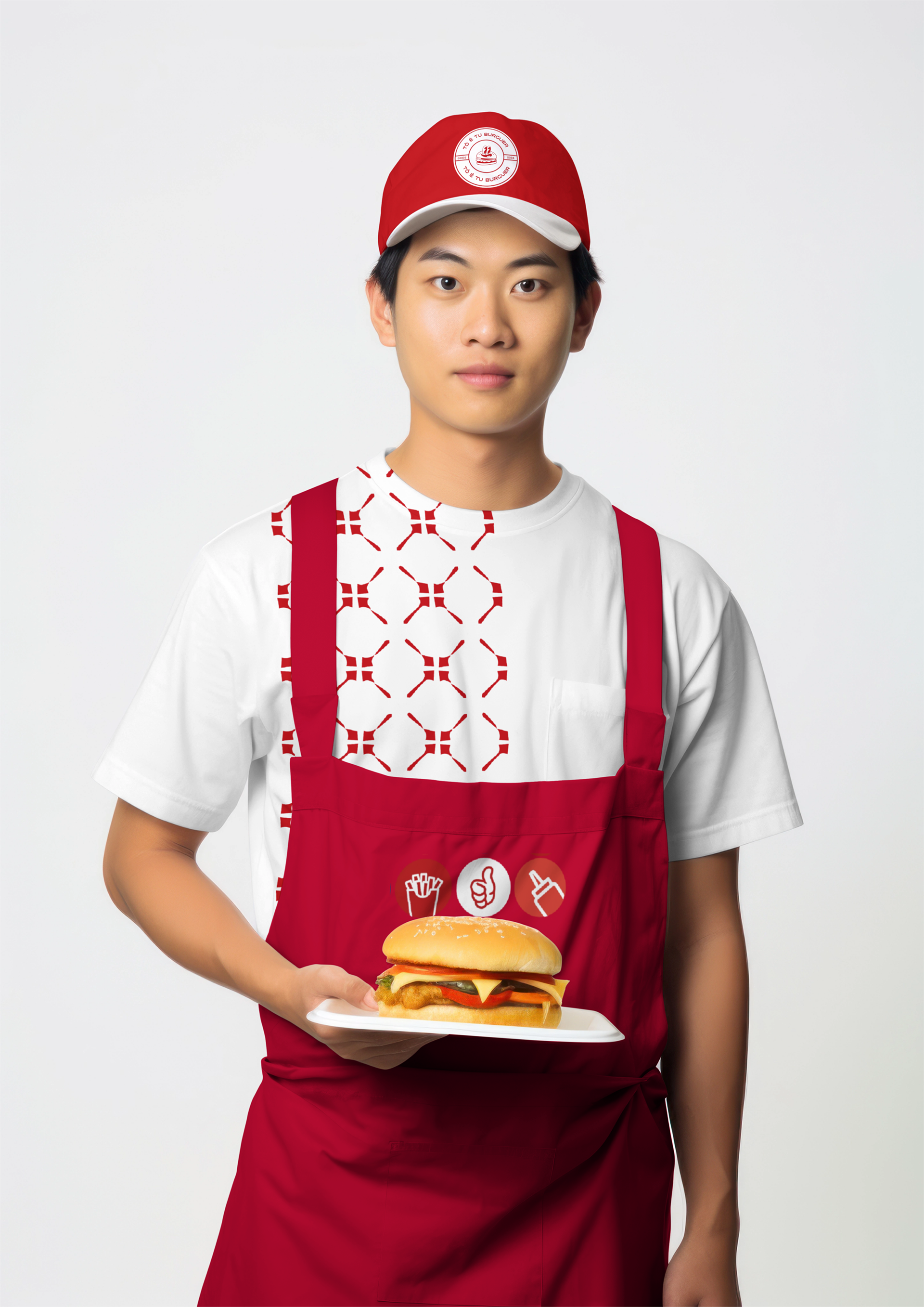
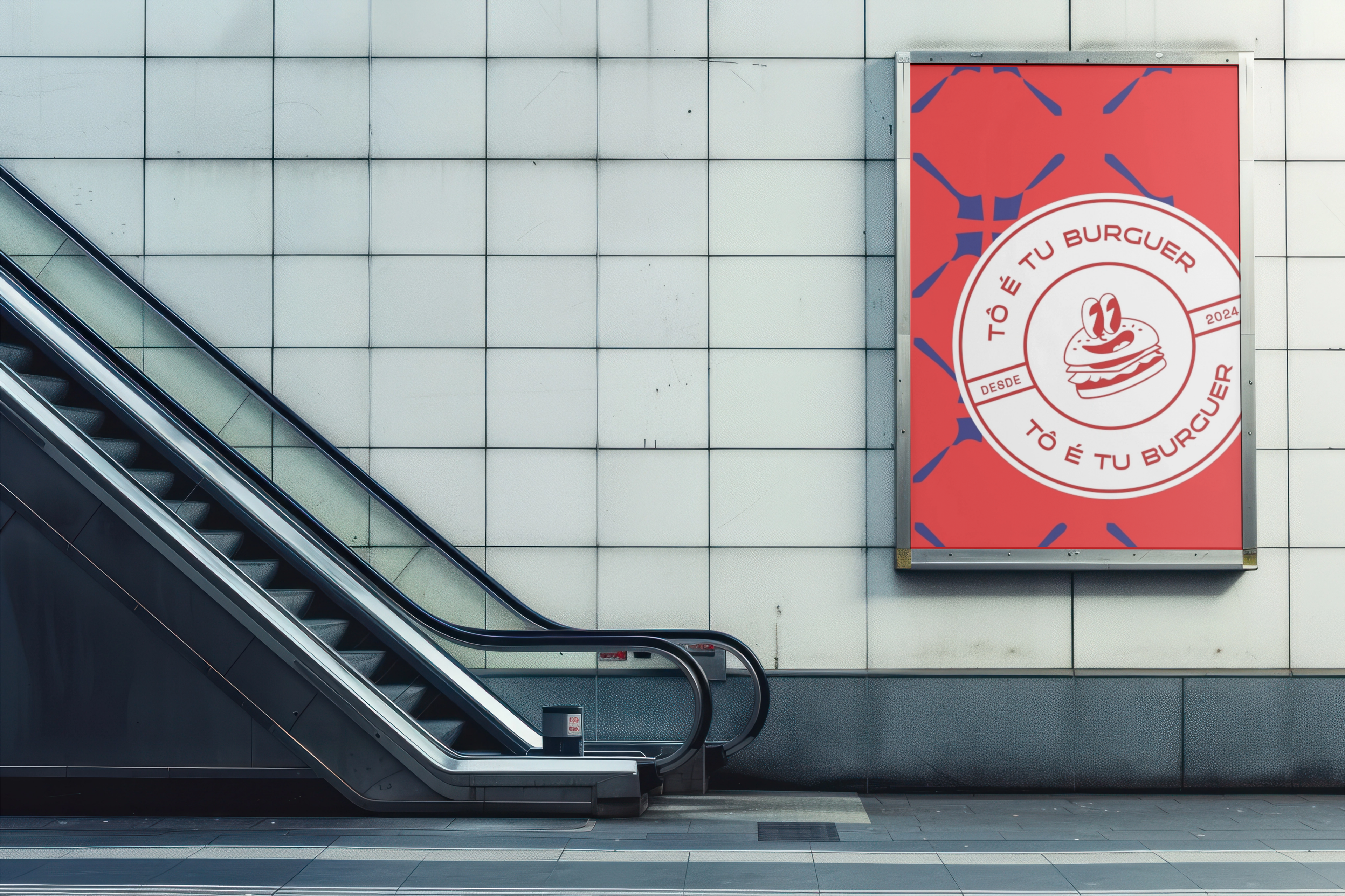
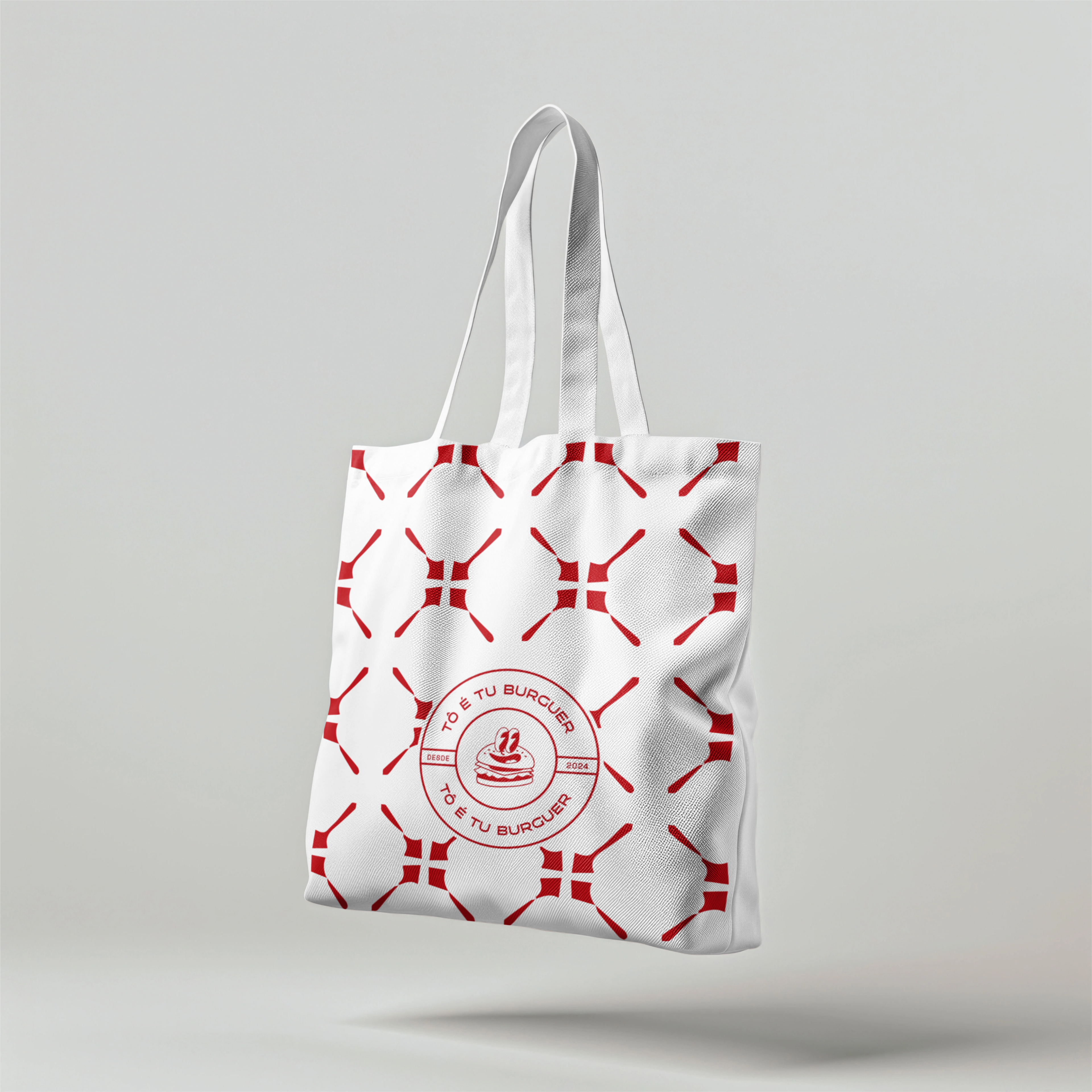
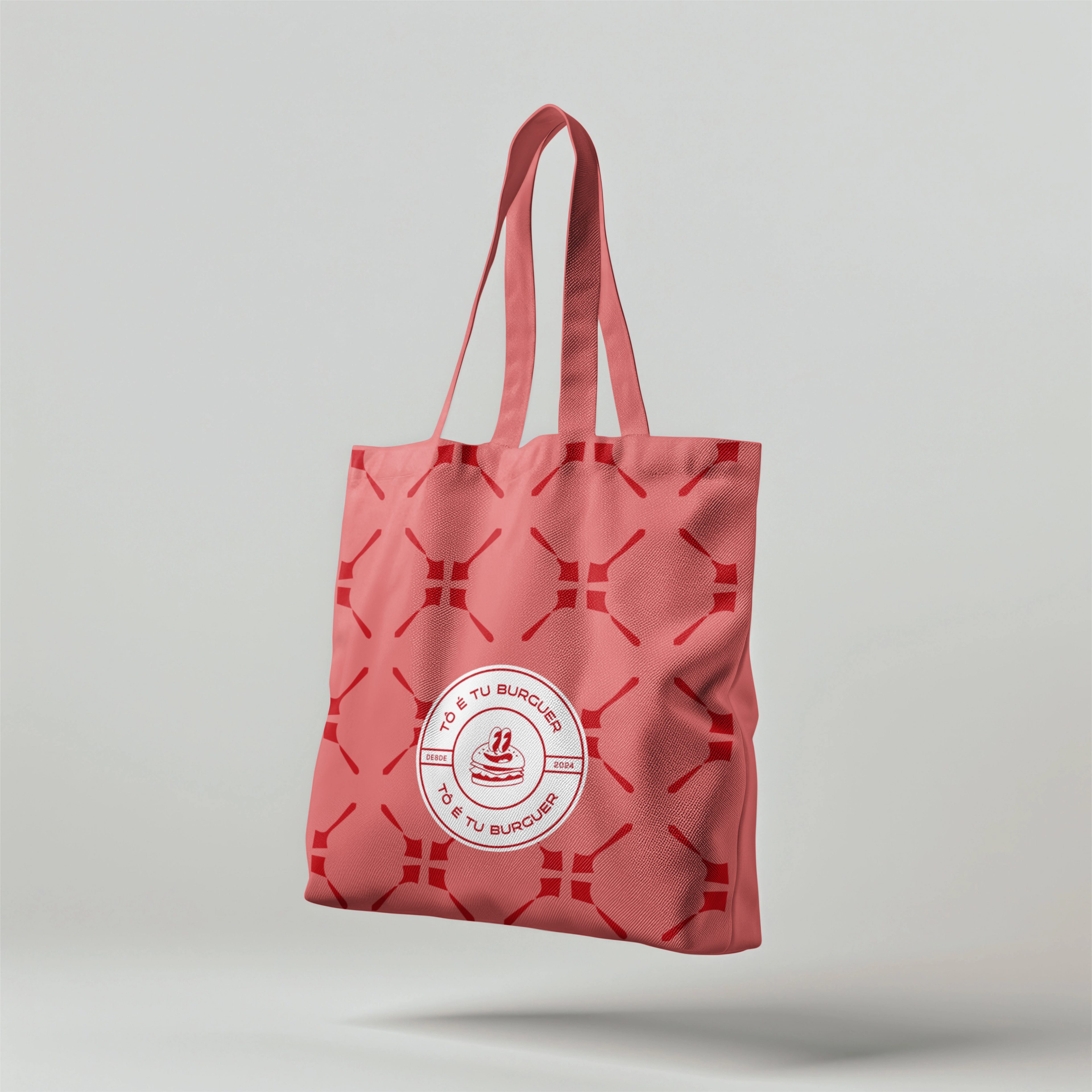
A identidade visual logo tinha como requisito do cliente o uso (criação) de um personagem na logo. Portanto, para trazer aspectos regionais de São Luís e do Maranhão, utilizei as cores da bandeira maranhense (vermelho, azul e preto) e formas visuais do centro histórico nos elementos de apoio. Escolhi utilizar a forma dos nossos azulejos, que são característicos da cidade e sua história.
The visual identity had the client's requirement of an original character, created for the brand and used in the logo. Therefore, to bring regional aspects of São Luís and Maranhão, I used the colors of the Maranhão flag (red, black and blue) and visual elements of the historic center as supporting visual elements. I chose to use our tiles, which are characteristic of the city and it's history..
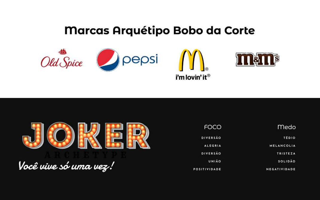
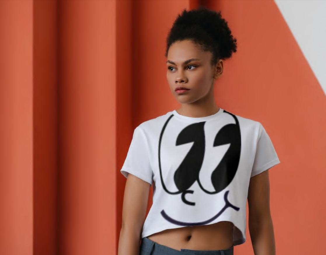
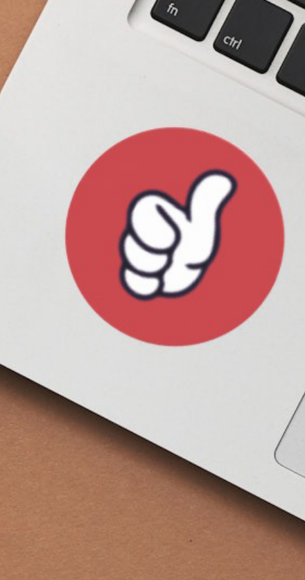
O PERSONAGEM
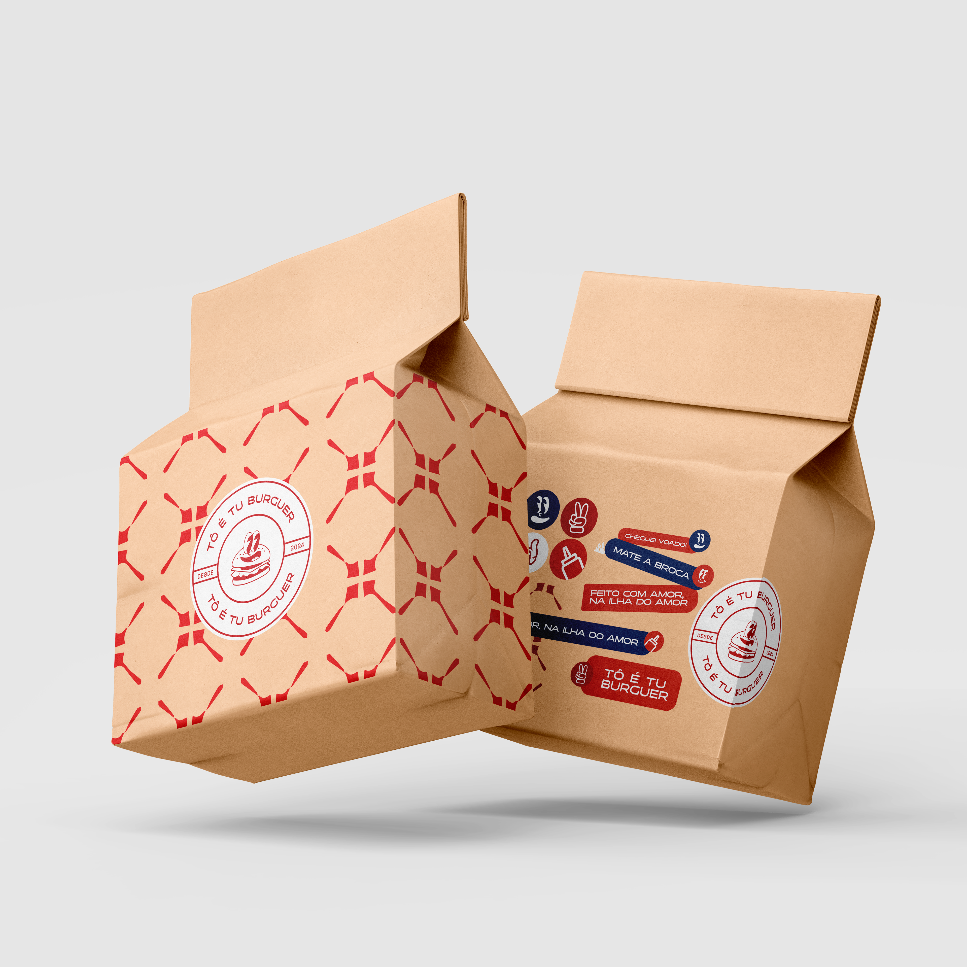
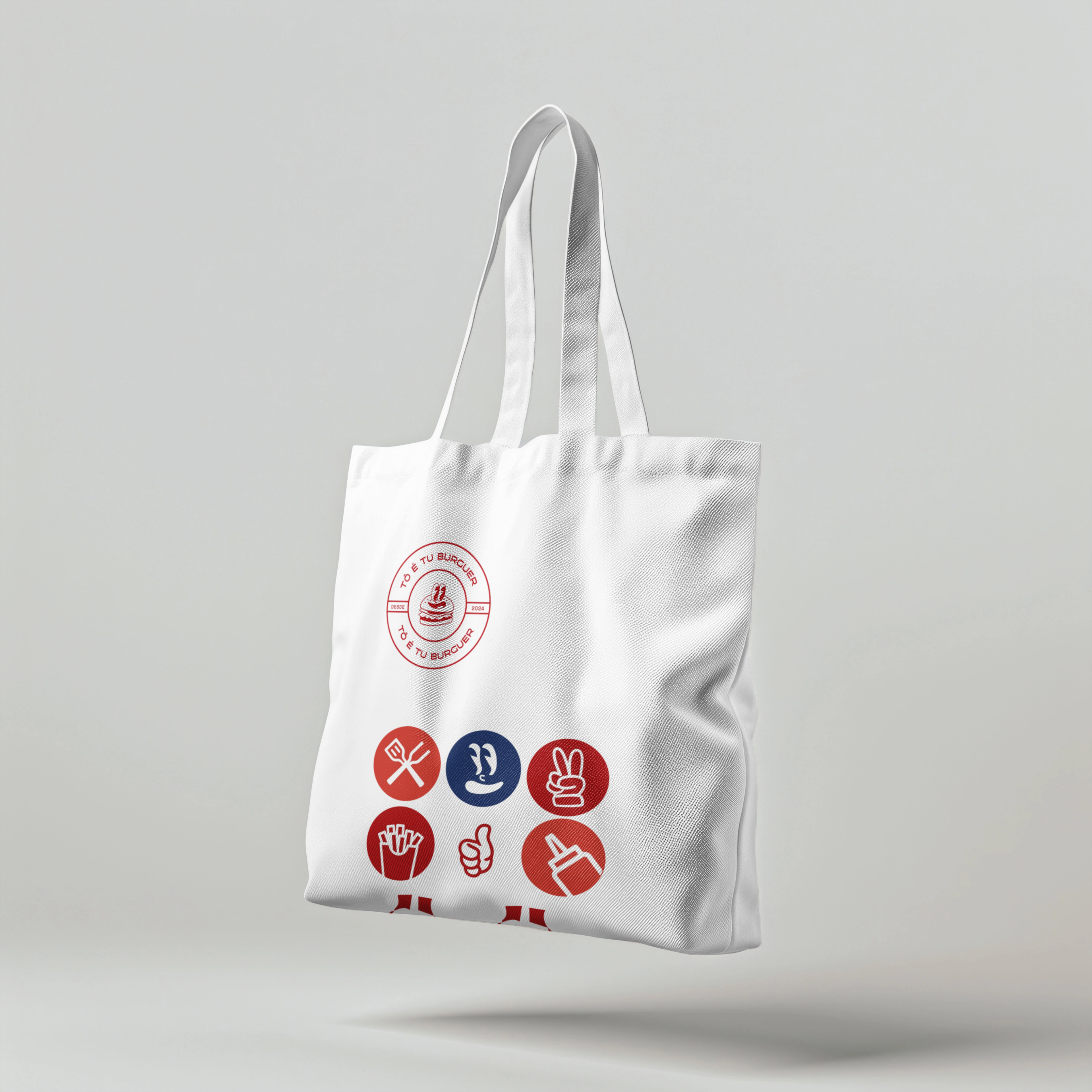
A logo tinha como requisito a utilização de um personagem que fosse leve e divertido, capaz de trazer o arquétipo do bobo-da-corte à vida. Por isso foi criado, além do personagem alegre da logo, variações de gestos e expressões faciais para que ele possa trazer diversão e positividade, sem se tornar monótono. Também foram criadas frases com expressões regionais ("cheguei vuado" = cheguei rápido; "mate a broca" = mate a fome). Tudo isso humaniza a marca e permite que ela se conecte melhor com o público.
As referências visuais do cliente para o personagem eram direcionadas a um estilo de ilustração cartoon vintage.
THE CHARACTER - The logo's requirement was to use a character that was light and fun, capable of bringing the jester archetype to life. That's why, in addition to the happy character of the logo, variations of gestures and facial expressions were created so that it can bring fun and positivity, without becoming monotonous. Phrases with regional expressions were also created ("cheguei vuado" = I arrived quickly; "mate a broca" = end the hunger). All of this humanizes the brand and allows it to better connect with its audience. The client's visual references for the character, and their personal preference, were geared towards a vintage cartoon illustration style.

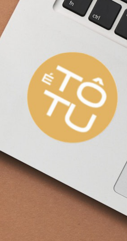
A LOGO


Projeto desenvolvido como freelancer.
__Personagem: personalidade, ilustrações, por Amanda Nava
__Identidade Visual: conceito visual, logo, cores, tipografia, elementos de apoio, por Amanda Nava
__Copy: imagens, frases e apresentação, por Amanda Nava